Apple Crumbs

http://applecrumbs.com/

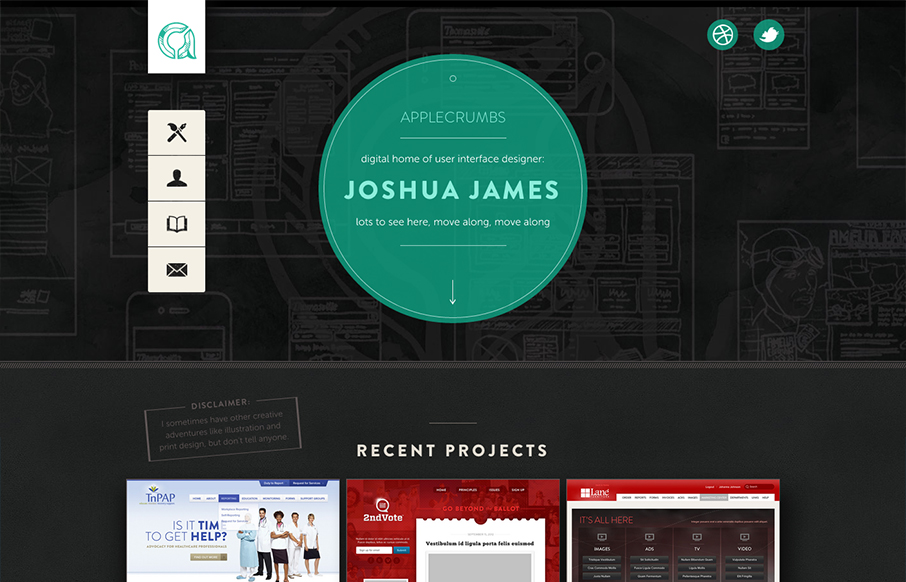
The distinct navigation layout change going from the desktop to smaller screen widths is a very nice difference from most other responsive sites’s i’ve been seeing. There’s also a lot of interaction built in as you mouse over and click on the various elements and links along the page.

2 Comments

  1. applecrumbs

    Wow, I’m honored. Thank you, Gene.

    Reply
  2. applecrumbs

    Wow, I’m honored. Thank you Gene.

    Reply

Submit a Comment

Your email address will not be published. Required fields are marked *

News & Articles

Looking Fast: The Art of Website Speed Perception

Looking Fast: The Art of Website Speed Perception

In the web world, technical speed and user perception matter. By improving design for a faster appearance, you boost conversions and stand out online. Speed isn’t just loading time; it’s perception.

Designing for Errors: Creating User-Friendly Contingency Plans

Designing for Errors: Creating User-Friendly Contingency Plans

Contingency Design hinges on empathy, understanding user frustration, and transforming errors into positive impressions. By embracing these principles, you enhance user experiences, retain customers, and boost revenue in the competitive digital landscap