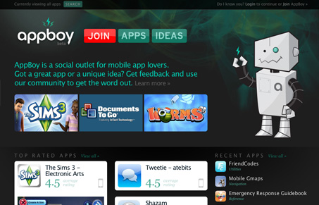
I really like the illustration for this site and that Smokey/green background image. The big graphic buttons are very clean and easy to see. The concept of the site is pretty good too, the ideas section had me reading for a while. I especially like the design of the “join” form, there’s nothing on the page but the form fields and the submit button, nothing else to click off and leave on.
Glassmorphism: The Transparent Design Trend That Refuses to Fade
Glassmorphism brings transparency, depth, and light back into modern UI. Learn how this “frosted glass” design trend enhances hierarchy, focus, and atmosphere, plus how to implement it in CSS responsibly.


Haha love the robot! The dark grey and aqua/green colors are beautiful, very well done!