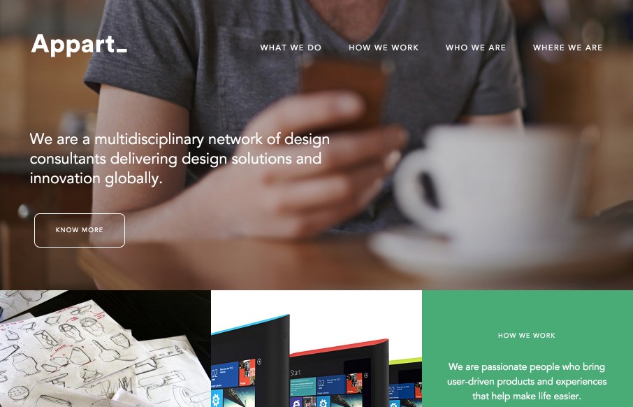
Good grid design throughout on this agency/product design site for Appart_ from, well everywhere apparently (distributed company – very distributed it looks like). See below from the designer, but I like the idea of using the grid / box design to be part of the “discovery mode” navigation.
From the Designer:
With all the focus on the images we crated a a grid/collage of projects, designers, locations and other events that allow the user to navigate in a sort of ‘discovery mode’.All the pages on the web-site are designed around the same grid/collage concept that is complemented with solid colored boxes that help communicate the company’s identity and message.
Submitted by: Miquel Padres Gonzalez
Twitter: @MiquelPadres
Role: Creative Direction


0 Comments