
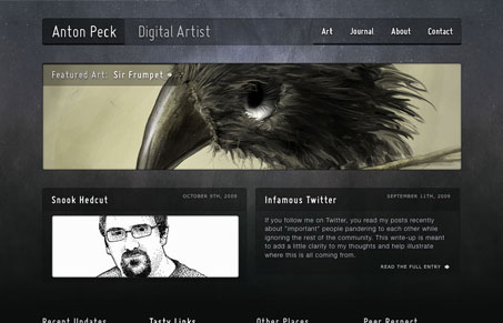
Really this is a straight forward type design, rather traditional and simple. What I like about it is that it’s simple and expected yet has a really great background and texture to it. Great illustration goes a long way too (i’m such a sucker.) Cool looking blog/journal too.




I love color, texture and absolutely love the use of Miso in the design. It’s a great showcase for Anton’s work.