Submitted by Will Hives, @willhives
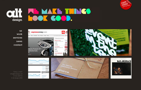
At last we finished our own site and it’s one (we think) to be very proud of. Clean, simple and easy-to-use with nice technology.
Take a peek for yourself.
Any comments would be great.
This is a very nice simple design. Nothing really fancy going on here, but that’s the point with this design. I like the three column/grid layout here and I like the big vs. small images of work featured throughout the site.


I like how you’ve used whitespace (or in this case, brownspace) to divide the site logically and visibly. Very nice!
I like that the spacing and proportional relationships of the image boxes are very similar to those between logo and the tagline. This is how you make clean and simple work and is an example of why it’s hard to do. It’s not just about negative space, it’s about having the elements that are there be exactly the right size and in exactly the right location.
This is a perfect example of how a subtle hint of Flash and Javascript can really make good semantic markup and well proportioned design shine.