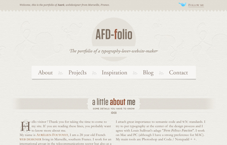
I really like this design, it’s really monochromatic and looks like it would be soft to the touch somehow. The colors used for contrast are also chosen well. There are some nice little details in this design as well, the ‘up’ arrow that disappears when you are at the top of the page and all the little sections are just nicely done.
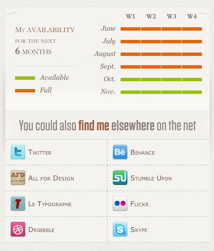
My favorite part is the “let’s talk together” section, the availability calendar is a really nice graphic.


For a personal site this is really interesting and refreshing. I think it would do everyone good to really look into all the things Gene has pointed out and more. I laughed at the comment “soft to the touch” … but he’s right, check out those inset flourishes in the top!
The “Some Inspiration” is really cool, like the pop ups that show me where I’m going – I wonder how hard that is to update?
Lastly, I would tweak the text wrap in the about me section around that illustration.