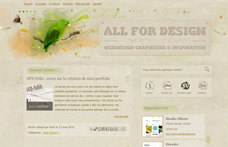
This may just be a template (says it’s by Auré – whomever that is, might even be this designer) but I still want to review it. Let me know if anyone knows and I’ll update here.
There are definitely some things here that stick out as theme parts, like the social media icons “section” and of course the blog like two column layout. But I like the overall feel to this design. The texture, the brown/tan color and a good portion of the details are just nice.


Hi 🙂
Well, thanks for this feature I appreciate.
My name is Aurélien Foutoyet, I’m a french web designer.
This is a unic template made for my personal blog and running on WordPress.
My blog have a little bit more a year of existence and, despite the fact I think I could bring huge improvements to the overall design, I have received lots of positive feedbacks. It seems that some people like this design so it’s cool. I often see my blog on galleries, blog post and so on.
More recently I have designed and coded my personal portfolio (http://all-for-design.com/portfolio) which is, to my mind, much better than the design of the blog.
Thanks a lot for this review it’s really cool. I’m often taking a look to your gallery and I have to say that you’re doin’ some really good choices. There is lots of inspiration stuff here 🙂