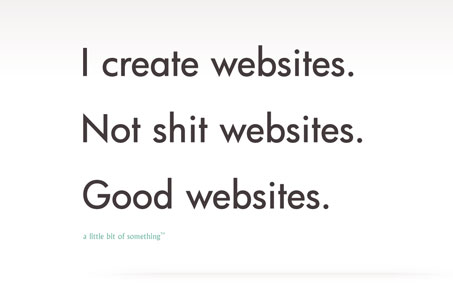
Aside from being a fairly minimal design the central piece of this website that’s so compelling is the copy. I’ve read over this page at least 5 times just for my own amusement and it looks like it has over 12,000 facebook likes – that’s strong.
With sections like:
I am a male human. For over 12 years, I have designed websites. Prior to that, I was a shepherd on a remote island in the pacific. I wasn’t. I was a recruitment consultant; people spat at me in the streets and shouted, “You’re nearly as bad as an estate agent, you knob.”
How can you not like this website? My only gruff is that I wish the guy would have really put his name on it.


Love the blunt honesty of this website. Though it is entertaining, and down right funny, my initial reaction was that maybe it was too bold for the client who may be reading it. Afterwards I realized that this guy is speaking to the audience he WANTS. I think he’s used his content to his advantage; weeding out all the types that he doesn’t want to deal with. So for that I went to his facebook page and liked it myself. I love this site. I feel more designers would benefit from having similar content in their sites. That way I don’t have to hear them complain at conferences about thier “clients” b/c frankly, I don’t give a shit. I rank this with a 10 for use of honesty.
The humor basically comes off as being a less funny version of the work of people like David Thorne (27b/6) and John Lindsay (E-mails From an A**hole). We all want clients to let us make design decisions because we’re design professionals, right? So let’s agree to leave humor to the professionals too.
I hope this works out for this person but I really can’t imagine the audience for this. There’s a fine line between being a bit cheeky and being a dick.
I love the copy, boom.
It’s what designers and developers feel most of the time and never say. With this site it seems his audience is that, designers and developers. If I was a client ( I’m not, though. ) I might be a bit intimidated or turned off by the copy as clients need to be held!
Overall, a giant buzz was created with this site, job well done. =]
Yeah, I agree Chase. Jay and I actually have a disagreement on this. I’m with you, I think it’s satire. Now if you don’t think the guy is funny, then that’s that right, but like you I quite enjoyed it.
I always find it amusing when a designer think’s his work is better than it actually is : /