
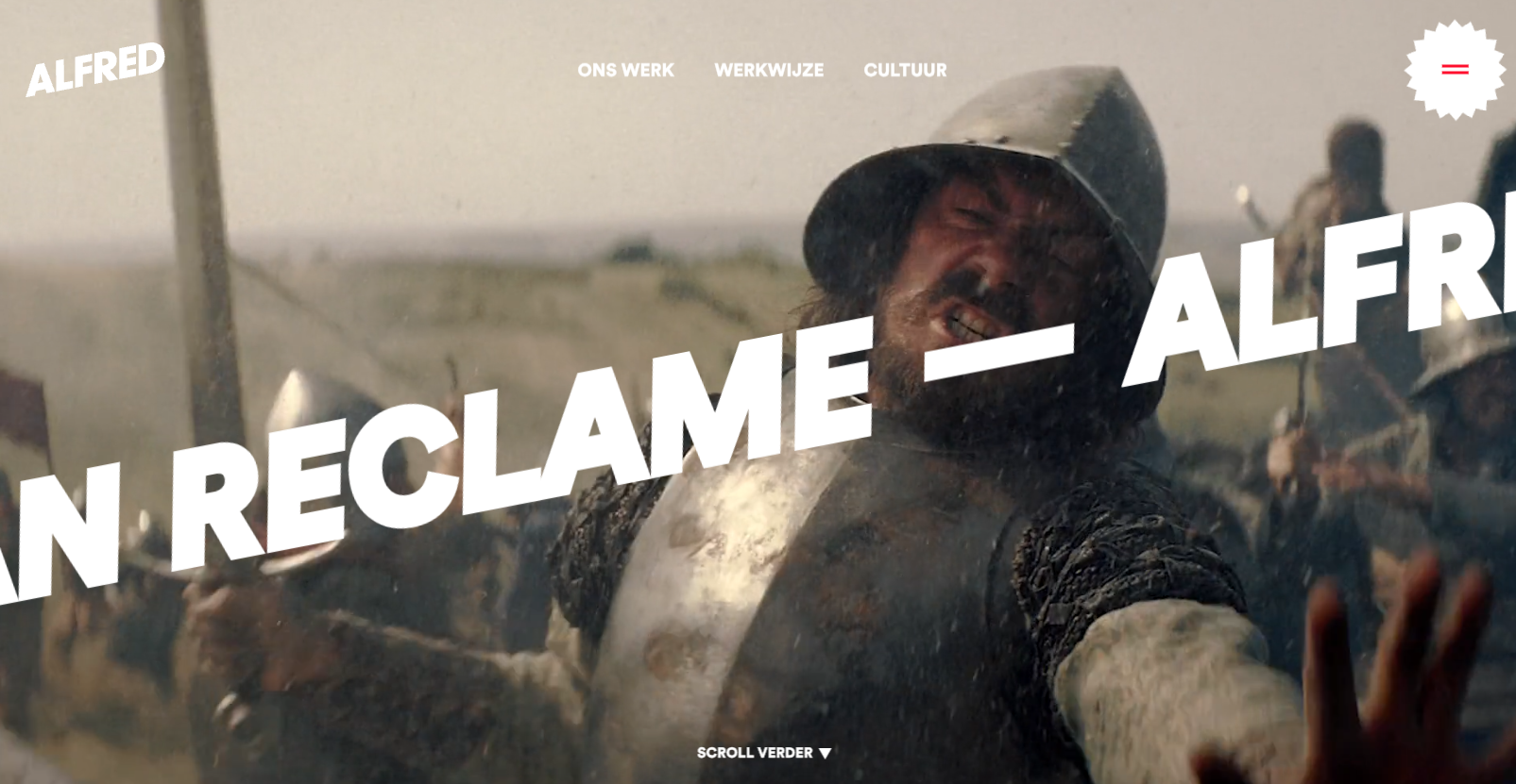
In the hero header, a bold, easily readable text layer smoothly scrolls from right to left. What stands out is the minimal word count, making reading during motion user-friendly. Moreover, this moving text layer is overlaid on an animated video roll, and the well-coordinated speed and content of both elements create a pleasing overall effect.


Fitts’s Law: Why the Easy Button Wins
Large, close targets are faster to hit than small, distant ones, that’s Fitts’s Law. A look at the 1954 rule behind buttons, prime and magic pixels, thumb zones, and dark patterns.


0 Comments