Submitted by Luke Hardiman @lukehardiman .
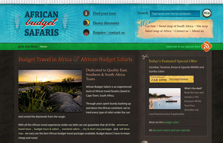
The rich colour palette and textures on this site are inspired by township shops and well known South African budget products. Veerle Pieters colour palette on the Duoh blog was also an inspiration.
African Budget Safaris users are generally young travellers and backpackers who are interested in getting to grips with local African culture, as well as experiencing the wildlife and unique landscapes of the African continent.
There is a lot planned for the future development of this site, in particular an African budget travel blog, fleshed out location pages with rich up-to-date guide book style info, advanced tour search and ajax currency converter.
Visually this site is really nice and has a lot of impact with the graphics. The colors and textures are really nice and the photography feels unique. This is a quite stunning website graphically.
There is a problem in that there doesn’t feel like there is a starting point for my navigating around the site. As a user i’m looking for the tell-tale block of navigation items, I see the links in the header but the way they are split up makes it hard for me to build a quick model in my mind of how the site is organized.


Thanks for your comment re: the navigation. I am seeing this reflected in our analytics, in that users are spending a long time on each page but generally the number of pages they are visiting is fairly low. I’m also tracking the number of clicks on the ‘find your tour’ nav button, which has been pretty low. A change to the primary nav is in order I think.