Found via @AdaptivePath.
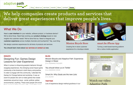
Update to adaptive path’s homepage, it’s amazing what a homepage makeover can do for your site. Adaptive path features a very deep site when it comes to content, heck their site is a great resource for all things usability and user experience design. I love the hierarchy of the updated home page, it really features what’s important in their message in the best way. The video is also very well put together and a really clever way to show off their stuff. All in all, the design is almost perfection for them and really breaths some new life into a site that’s got to be a couple years old by now.


I really like, well done guys.
Being picky I don’t like the red links & all caps headings.
I also liked the 3 main menu items on your previous homepage – they communicated a lot of what you are now choosing to communicate in words.
It feels like you’ve tipped the balance too much towards using links in short sentences over traditional grouped navigation.