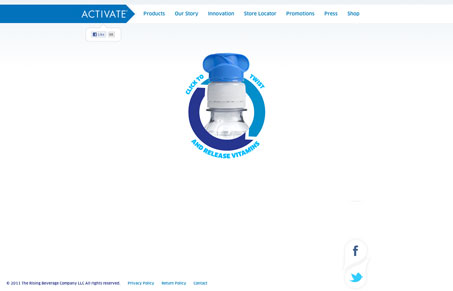
This is a pretty unique experience. Activatedrinks.com embraces the dynamic, interactive experience that web-based can provide by incorporating extensive use of css3. Its organic layout is strongly supported by subtle animations and a sense of great depth. The subtle blurring of the bottles and their transition to focus on hover is really quite nice as is the color shift that the main navigation goes through whenever a user scrolls into a new content area.
This site is a great experiment in how to leverage motion and space within. It gets about as far away from standard grid based design as is possible and still feels pretty tightly structured and easy to follow, though some of the content seems lost in the wash in the later content areas.
activatedrinks.com has the look and feel of a moving, interactive magazine image ad and I think it works pretty well.


0 Comments