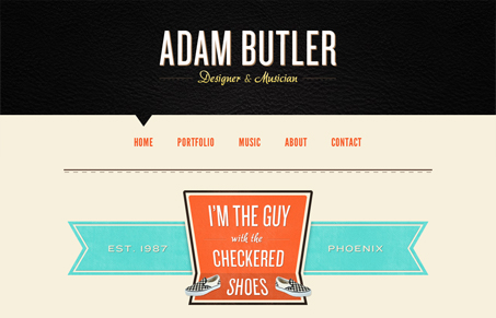
Nice bold layout and strong colors used in large areas make this design sing. I like the almost oversized sections and elements of this design. I also really like how each page is just a little bit different in terms of the content layout. That’s a nice touch that just says to everyone that you care about your craft and you’re willing to put in what it takes to make something look great. The music page is probably the most fun looking section of the site.


0 Comments