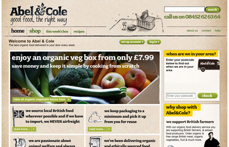
I really like the overall feel of this design. The paper-like background and the hand-drawn lines, really nice. The thing that’s sticking with me is how all the copy is bold, I don’t know what’s what from a regular to bold set hierarchy in regards to the content and as a result the site/content is difficult to scan. I really like how all the action items (links & buttons) are all the same consistent green color, that makes it easy to spot the calls-to-action on the page.
Glassmorphism: The Transparent Design Trend That Refuses to Fade
Glassmorphism brings transparency, depth, and light back into modern UI. Learn how this “frosted glass” design trend enhances hierarchy, focus, and atmosphere, plus how to implement it in CSS responsibly.


0 Comments