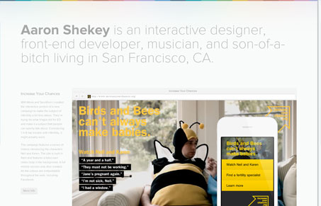
At first glance this is a clean, simple site but it’s got a little more going on under the hood. It’s a responsive design, and the thing I like most about it is that once you get down to the smaller size you’re given nice buttons with the option to email or call. Nice touch considering visitors will be seeing that on a mobile device in most cases. I have to admit though I didn’t notice the contact info at the bottom of the large site at first. Tying in some of the color from the top of the page might help push that a tad. Overall I really like the way the work is presented. There are large screenshots on the home page and a really unique full screen montage on the detailed pages. Adding the keyboard nav is a nice (and useful) touch in this case. I think the opening headline that changes out on the home page is a fun element too. This is a great example that simplicity doesn’t have to be stale. Well done Aaron.
Review by: Maria Frey
@mariafrey | mariafrey.com


0 Comments