826chi.org

826chiorg

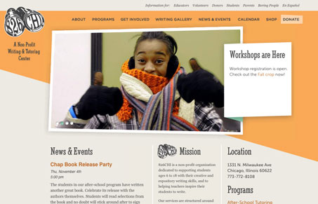
Pretty straightforward design and execution here, but the large horizontal shape gives it some much needed impact. It also really drives your eye across and down the page. I really like the call out box next to the big image for the slideshow too, that little 3D looking flourish is a nice touch that sticks out to me.

The sub pages are also very strong with the color change and layout differences that are employed. This site keeps you interested from page to page visually just by using color and shapes, that’s great stuff.

I really like this website design.

0 Comments

Submit a Comment

Your email address will not be published. Required fields are marked *

News & Articles

Looking Fast: The Art of Website Speed Perception

Looking Fast: The Art of Website Speed Perception

In the web world, technical speed and user perception matter. By improving design for a faster appearance, you boost conversions and stand out online. Speed isn’t just loading time; it’s perception.

Designing for Errors: Creating User-Friendly Contingency Plans

Designing for Errors: Creating User-Friendly Contingency Plans

Contingency Design hinges on empathy, understanding user frustration, and transforming errors into positive impressions. By embracing these principles, you enhance user experiences, retain customers, and boost revenue in the competitive digital landscap