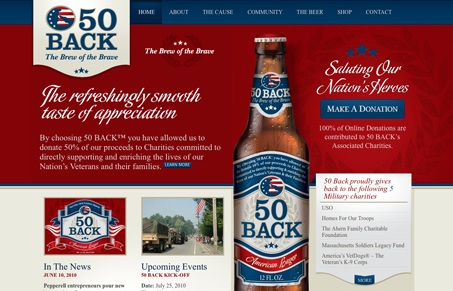
I love the tight crisp lines in this design. The colors are bold and strong, like a beer brand based after “America” would no doubt look like. The flourish shape at the bottom of each dropdown is a nice detail, in fact this site has many little well done details. Makes me want to try this beer for sure.


0 Comments