Submitted by Luke Williams @luke_redroot.
My proudest design yet, I’m submitting my WordPress-powered site since I think it belongs among the great sites featured on this gallery 🙂
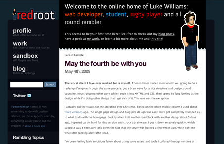
Really nice blog & portfolio. I like the pixelated illustration style and the overall colors of this site. Good detail work on all the roll-over states and back-to-top link. I also like the “first time here” text he’s doing.


It does seem like he has put a lot of thought into the user on this site with all of the different rollovers, including the one over the logo that says “go home” and a “go to the top” arrow that only shows when I scroll down far enough.
The portfolio also shows lots of thought put into it through the detailed description of each work and his role in doing it.
I also get a friendly, down-to-earth vibe from the copy which is a nice break from the “I’m a badass designer” mentality that a lot of portfolio sites give off.
I couldn’t agree more, I like the copy too. I’m also tired of the “Hey i’m a designer and I love HTML/CSS…”
It’s got some ok stuff going for it, but I’m confused as to why he used strikethrough for the hover state on the main navigation. When something is struck through, it generally means it’s been deleted or edited. It’s important to think about the meaning of the elements you use on your page, and not just use them because it’s a cool effect.(waka waka)That’s a fair point, should really practice I preach, so I changed it. Thanks for highlighting that for me 🙂