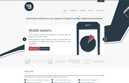
I like the approach here, the mix of personal and professional stuff. The work with the # of drinks consumed on the home page next to the twitter stream is kind of cozy. I dig the monochromatic colors highlighted with the red here and there.
My favorite part is the contact page with the distances from their shop to other cities.


0 Comments