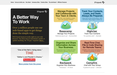
I wanted to take a little more time and look at how 37signals has evolved their main website over the years to get where it is today.
Not to ignore this new design, I think it’s really good. It’s typical 37signals design style for sure; clean, straight forward, crisp and chock full of great copy. I do feel like they are trying to do quite a lot with the homepage, some of these elements could easily be placed “inside” the site. Finding a balance between what needs to be on the homepage and what doesn’t is something I struggle with on each homepage I design. It’s good to see how fearless these guys are with their homepage. 37signals website designs really embody their views of business and web design, they blog about it, write books about it and live it. As seen in the design history of their main company website:
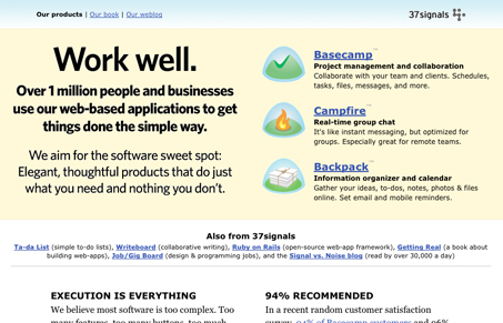
Until recently
They’ve carried over the minimal/clean feeling with their new website from their most recent past design (recent enough that is…) The large product icons are a mainstay now, it’s neat to see that they are pretty much the same size as before, I wonder how much they thought that over… Before the most recent iteration of their site design and this one they self published their latest book Getting Real.
Circa 2005
They carried this look for quite a while. Very minimal and clean, but extremely long. There never seemed to be any real rhyme or reason to it, maybe it just grew long over time as they got busy and just tossed content on the page.
Circa 2002
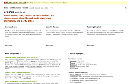
This design version is from around the time I first noticed 37signals. Clearly they believe in minimal design, there’s almost no images on the page, it’s all copy. At the time, Flashy interfaces on websites was king and there were a lot of really bad flash implementations to go around. They certainly had a very niche business oriented design style. After this website iteration and before the next they published their book about defensive design.
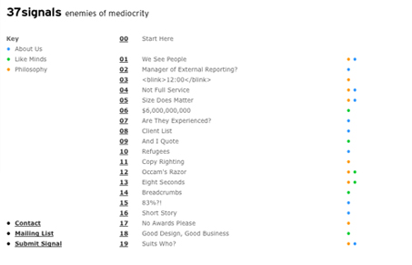
In the beginning…
This is from what I can tell their first company website. It’s really arranged more like a blog (this is way before Ruby on Rails and WordPress.) Extremely minimal and almost 100% text based this design stood out among the masses of animated, design for style websites of the day.
Over the years 37signals has shown that business goals and user tasks are at the forefront of their design aesthetic. They have preached that good usable design will win out in the end and they’ve truly lived this in every aspect of their website and product interface designs. I guess you could maybe say they make usability sexy…




0 Comments