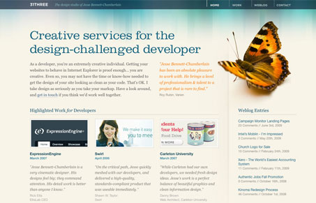
This design isn’t new, but I was a little surprised to see that we hadn’t put it in the gallery over the past couple years. It’s a really great design and one i’ve looked at quite a few times when looking for inspiration on my own design projects. We featured the first iteration of this design a while back, but this one just slipped past us.
I love the typography on this site and the solid grid and colors. There is plenty of subtle color work and grid work. The portfolio has nice big versions of the work making it nice to look through.


Great design. I like simple lines and keeping things clean and simple. Not my favorite colors but that that is just me. Beautiful.
It looks like 31three was re-designed since this post. It has been completely overhauled, but still looks fantastic.
@Cory – It sure has, check it out.