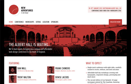
Man looks like Greg Wood (@gregwood) has outdone himself with this site. The design is simply gorgeous! The details are all there as I expect too. The red/black & white makes the site feel almost classic to me – not sure if this is a homage to Roger Black’s design esthetic or not. Never mind the speaker lineup, god I wish I could go to this conference!
It’s responsive too, but you’d expect that for the New Adventures site right?


0 Comments