1md.be

1mdbe

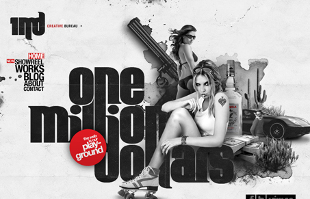
I love the vibe from this website, you really get to know the studio from just looking over the site. I really like that quality to this particular website. It’s not often you can really get a feel for the company like this from the website – granted I don’t really know these people, but it’s what they are projecting.

I love the large graphic elements and the use of @font-face is subtle but you defiantly notice the typography is well done. They’ve got a pretty badass show real too, check it out.

2 Comments

  1. Flo - Web Designer

    I think the key to this site is their show reel. Having video on a website showcasing what you do just sells your work 100 x better than having to click and view each piece individually. Go video…

    Reply
  2. Gene Crawford

    I couldn’t agree more about the video, I love those showreels.

    Reply

Submit a Comment

Your email address will not be published. Required fields are marked *

News & Articles

Sign-Up: Enhancing Conversions through good UX

Sign-Up: Enhancing Conversions through good UX

Optimize your website’s sign-up process by focusing on clarity, ease, and user mindset. Clearly explain the purpose, benefits, and steps, and use social proof to build trust and drive conversions.

The Essential Guide to Getting Started on Freelance Writing

The Essential Guide to Getting Started on Freelance Writing

Explore the lucrative and fulfilling world of freelance writing with our essential guide. Learn about specialties like blogging, social media, article, and technical writing. Build a portfolio, find work, set up your business, and discover the potential earnings. Embrace the freedom of working from home and follow tips for success in your dream career.