
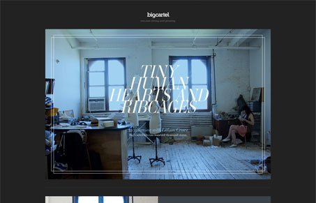
I really enjoy sites that have a very magazine-like appeal. 100k.bigcartel.com is such a site, relying on a strong integration of great photography and typographic treatments. The consistant overlay of type on image is dramatic and effective, though the titles can he a bit hard to read. 100k.bigcartel.com is yet another site that is drinking the simplicity Kool-Aid and does a great job of creating a strong visual experience with very few elements.




0 Comments