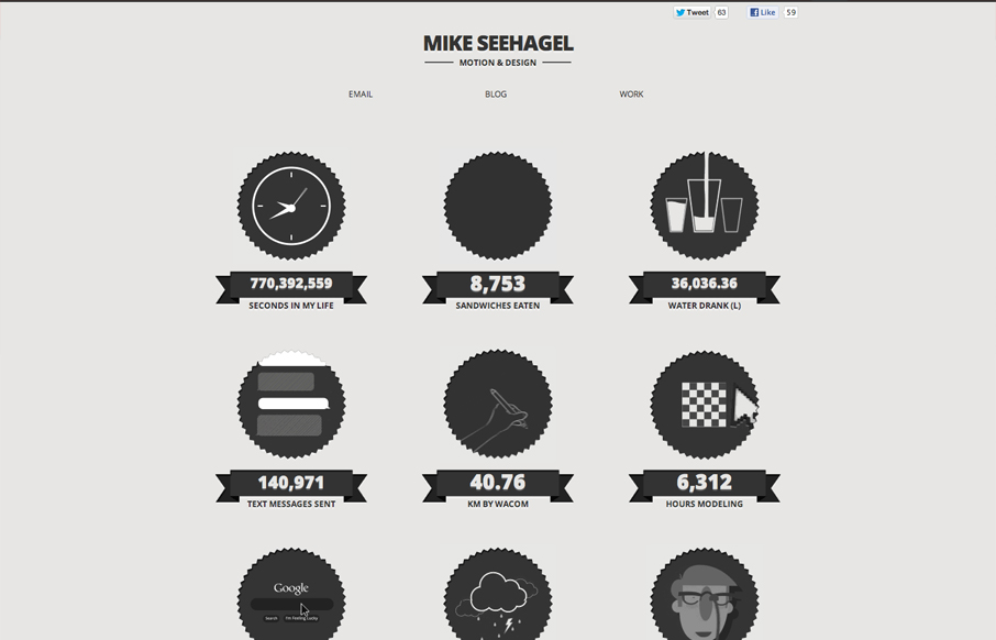
by Giovanni DiFeterici | Aug 21, 2012 | Gallery, Portfolio
This is a great example of how .gif images can be used to liven up a static page. I won’t say that it’s not busy here, but the tone is fun and the crisp artwork looks great. A love the achromatic palette. I can’t vouch for the accuracy of the data...

by Gene Crawford | Jul 31, 2012 | Gallery, Portfolio
Submitted by: Robby Leonardi @rleonardi Role: Designer & Developer Great illustrations mixed with some interaction like this is a win. I love the sideways parallax and the way the other items animate into view as you scroll down. Fun and lite the design here is...
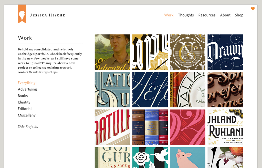
by Gene Crawford | Jul 3, 2012 | Gallery, Portfolio
Launched a new version of my website! jessicahische.is I think you’ll find lots of new goodies + it’s a lot easier to navigate— Jessica Hische (@jessicahische) July 2, 2012 The new Jessica Hische website is fantastic. Yeah yeah I just posted her wedding...

by Giovanni DiFeterici | Jun 19, 2012 | Gallery, Portfolio
jeremycowart.com is a great site to show off Jeremy’s work. The homepage is striking in its boldness and gives a direct and immediate view of some of Jeremy’s best work and the rest of the design is bold, minimal and progressive. The use of masonry...
by Gene Crawford | Mar 15, 2012 | Gallery, Portfolio
Submitted by: Jon Saul @jonsaul Role: Designer I think this is a great minimal/editorial style, with great photography too ! mentioned in the Creative Review Blog here: http://www.creativereview.co.uk/cr-blog/2011/august/editorial-photography-shoot-the-living...
by Gene Crawford | Feb 7, 2012 | Gallery, Portfolio
Beautifully designed portfolio site for Eric Barse. From the illustrations (they’re different on each sub page) to the responsive layout it’s very well done. The footer is very cool and also built to be responsive to screen widths which such a nice detail...