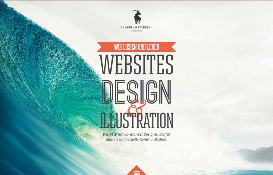
by Aaron Griswold | May 12, 2014 | Gallery, Portfolio
We get to see a lot of portfolio websites for designers and agencies from all over the globe here at UnmatchedStyle. Some of them can be convoluted, or too trendy. Konrad Mayerbuch’s site is neither – it’s clean, simple and if it has trendiness, then...

by Aaron Griswold | May 7, 2014 | Gallery, Portfolio
Really, really great design for a portfolio site. I love the different pieces worked up for the slider/hero area. Brilliantly visualized and communicated stories. The rest of the site is simply wonderful and simple as well.

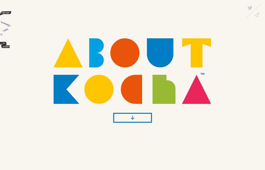
by Aaron Griswold | May 6, 2014 | Gallery, Portfolio
Very bold looking layout and approach. Cool loading graphics animations when you first load the page that gets your attention. I like the rest of the load in stuff too as you scroll down with the hover state animations to boot. Good stuff.
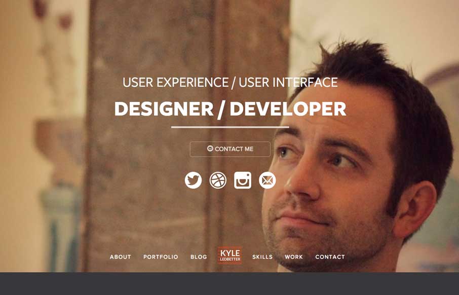
by Aaron Griswold | May 5, 2014 | Gallery, Portfolio
Very nice portfolio site design. Chock full of detail work and what you’d expect from a UX designer. Lovely colors and visual pairings as you make your way through the content and skills section.
by Gene Crawford | Apr 29, 2014 | Gallery, Portfolio
Damn I love this website. Just beautiful illustrations supported by a clean design base.

by Gene Crawford | Apr 28, 2014 | Gallery, Portfolio
Nice simple approach to a portfolio website. With some nice little details like forward and back arrows when you’re viewing a detail page.