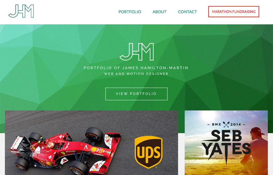
by Gene Crawford | Apr 12, 2016 | Gallery, Portfolio
Nice portfolio site for James here. I love the green background/shapes and the way the portfolio pics overlap slightly. Very clean layout and I loves it! Also, he’s running a marathon, so give the man some support! From the Designer: A responsive portfolio...
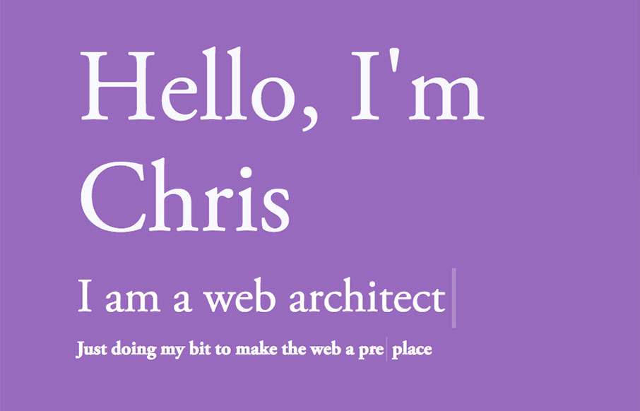
by Gene Crawford | Apr 7, 2016 | Gallery, Portfolio
Really cool pacing on the content blocks as you scroll down the page. Also some really clever interaction points, like the email link/icon that pulses in the corner and the side navigation that appears as you move down the page. Solid stuff there, worth a good long...
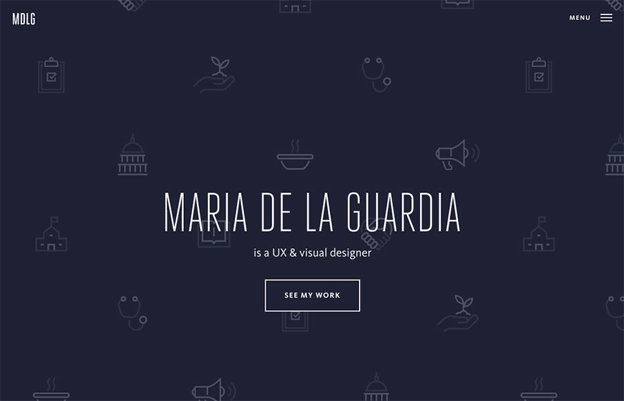
by Gene Crawford | Mar 28, 2016 | Gallery, Portfolio
Pretty cool, basic, Material Design based portfolio site for Maria De La Guardia. I dig the icon/illustration work on the hero/splash are and then how it kind of “dives” straight down into the work like that. Strong work.
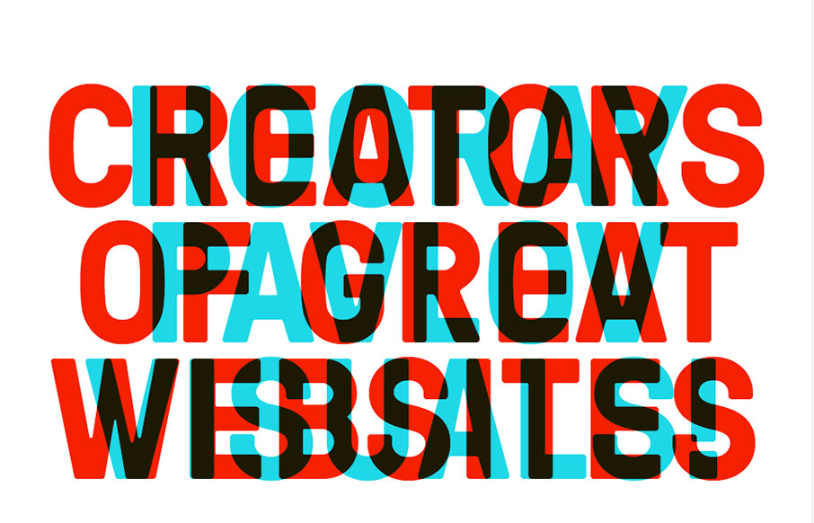
by Gene Crawford | Mar 22, 2016 | Gallery, Portfolio
Dayum man. I love the bold approach to the typography here, it’s a breath of fresh air really. Simple and to the point too. Some nice detail work here and there, solid and awesome work.
by Gene Crawford | Mar 17, 2016 | Gallery, Portfolio
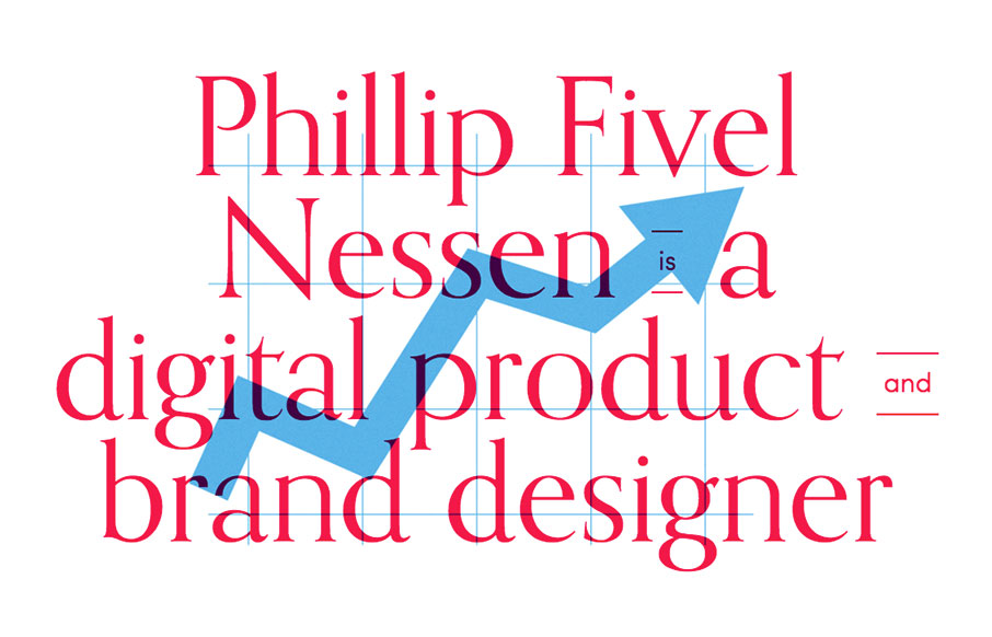
Suuuuper simple layout for the portfolio website of Phillip Nessen. But man, it has some real badass typography and illustration work going on. Love this stuff.
by Gene Crawford | Mar 14, 2016 | Gallery, Portfolio
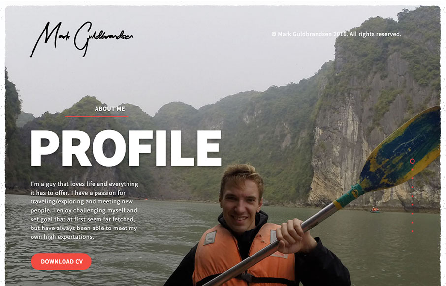
Nice portfolio website. It functions almost like a power point would, with big screens you move between. In that aspect I like the simplicity of the approach. What do you guys think? Does that work for you here?