by Gene Crawford | May 30, 2012 | Gallery, Sports/Recreation
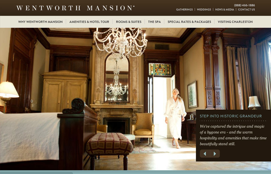
The Wentworth Mansion website by the fine folks at BlueIon here in SC is a very well crafted website. I love finding superb examples of responsive sites that aren’t agency or person portfolio websites. Very nice navigational design decisions for the iPhone...
by Gene Crawford | May 30, 2012 | Conference, Gallery
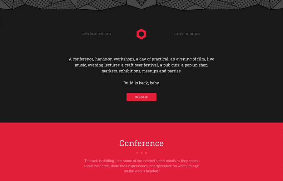
The 2012 Build Conference website is just beautiful. It makes me happy to scroll down and see the rounded headshots and then to discover the icons that have been designed to tell the tale of the workshops and finge events. The icon/illustration of Aaron Draplin is...

by Gene Crawford | May 29, 2012 | Gallery
Looking for one-page website inspiration and I found this. bookofbeards.com #inspiration— Jacklyn Burgan (@playfulpixel) May 24, 2012 Love love love this simple yet very bold design. It’s a bout beards so let there be beards right? Lovely changes on the...
by Gene Crawford | May 29, 2012 | Gallery
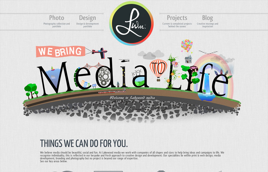
With this website we have aimed to achieve an impacting first response using unique designs and layout. Being a little different is what its all about, the Lakewood media website somehow stays conventional but steps over the perimeter of the norm. A flowing layout has...
by Luke Williams | May 29, 2012 | Gallery
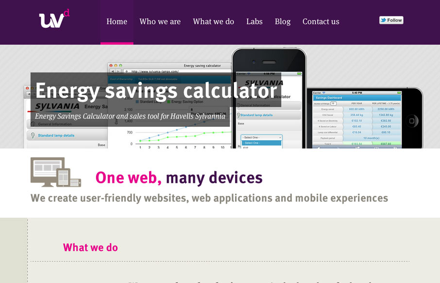
Fantastic new website by the awesome guys at Ultraviolet Design, the awesome responsive approach is matched by astute attention to providing a great UX and great typography, awesome work. ASCII FTW!
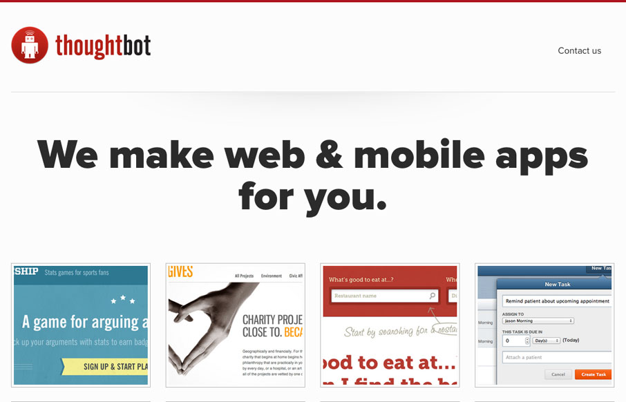
by Gene Crawford | May 24, 2012 | Gallery
I love the simplicity of the thoughtbot website design. The interactions on the home page portfolio images is really smartly done. The hierarchy is kept simple and gets more dense with content as you scroll down the page, with very minimal copy until after you see the...