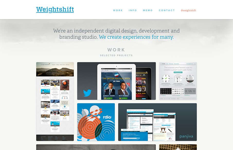
by Gene Crawford | Nov 13, 2012 | Gallery
Superb responsive design decisions made on this newest version of Weightshift’s site. Making the portfolio images get smaller and more button like for the iPad and iPhone screen widths is brilliant. I also think the focus on the selective nav elements as you get...

by Gene Crawford | Nov 13, 2012 | Gallery
Really beautiful product website here for AddThis. I’ve always liked their design and this one with the push for simplicity is the best to date. The animated background works really to give it some visual interest while not creating too much noise.
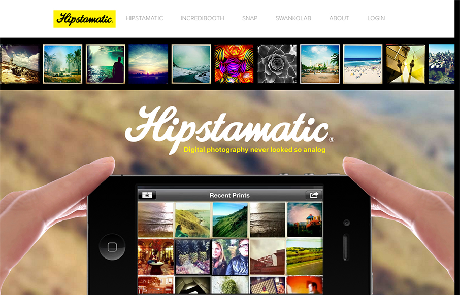
by Gene Crawford | Nov 8, 2012 | Gallery
Great quick storytelling is at the heart of this website. You see the hands slide on screen to show how to hold the camera and use the app quickly and succinctly. Brilliant even. You then get a similare treatment on all the other apps that they make, visuals helping...

by Gene Crawford | Nov 8, 2012 | Gallery
Strong graphic vibe to this website. It’s surprisingly simple but doesn’t compromise on coolness, which is how it should be I think for a site like this… Badass little short video too.

by Gene Crawford | Nov 8, 2012 | Gallery
The mixture of the long scrolling page and the screen clearing visual effect when you click on the nav item gives the site the feel that it’s not just a long form scroller. I’m not 100% sure if that’s good or bad. Nice responsive solution too.
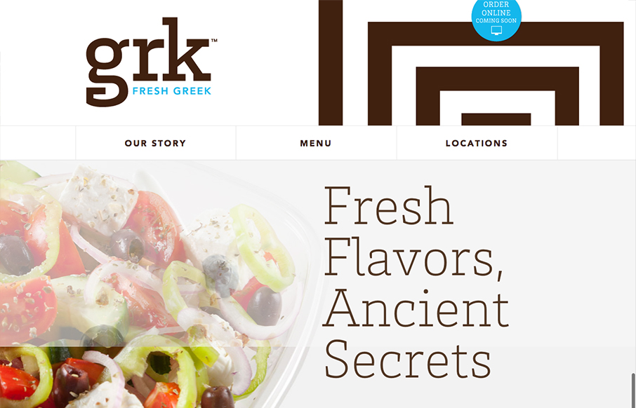
by Gene Crawford | Nov 7, 2012 | Food and Beverage, Gallery
Nice clean and responsive restaurant website. I love this trend of making restaurant websites responsive, give me more please! Overall nice presentation of the food and menu make this website attractive and highly usable. Bravo.