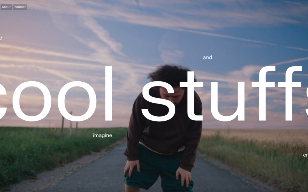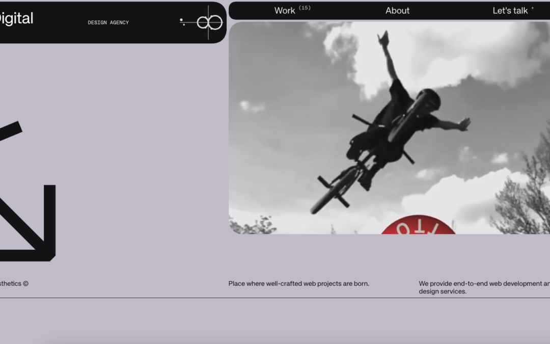
Man - this is some sweet work from Cast Iron Design out of Boulder, Colorado. After going back through the site, I almost made this a Friday in-depth review. They go straight to the heart of showing off their work on the home page, using this trend of background image...
Good Fortune & Wildflower
Love these sites from Resn out of New Zealand. They use Canvas / WebGL for a "quick" site. The Wildflower site you can share with a loved one.. over Twitter (or FB). There's some zen to all of it. Two related projects by same company, showcasing generated flowers on...
Eau de design
We really like this site from Stephane Varnizy out of Paris. Excellent movement on scroll and in the drawing of the SVGs. Also really like the coloring - and the Portfolio - good stuff there. From the Designer: Hi, my name is Stéphane Varnizy and I’m a French...
FHOKE
Reviewed Fhoke.com out of the UK less than 1 year ago....https://unmatchedstyle.com/gallery/fhoke.php - and like their new stuff. Listen, anyone who uses orange + full width + 880px headshots on the About page, is going big and bold with their design. That's how they...
Plug and Play
Plug and Play out of London has an interesting site. The content parts are fairly basic, and you might even think Bootstrap in those areas - but there are parts of the site that I really like. I'm really into movement on sites right now, so like the movement into the...
Search For Energy
Like the flat illustrations from Search For Energy site, done by Create the Bridge out of Texas. Also like the work with the Energy Usage Calculator on the Knowledge Center page. There are some navigation issues (mainly on the Login page - so assuming it's a...
Federation Square
I like the blocky-ness to this layout. Though at first it comes off as little cluttery looking, I find myself liking the way the navigation is done. The small black line with standard nav items and then the larger more central nav items under that to stand out more is...
Sporting Dog PRO
I'm going to be honest - I wasn't sure on this one at first. It's an e-commerce site from Sporting Dog Pro out of Charlotte, North Carolina. I wasn't sure about it, because my perspective is slightly skewed - I see agency and portfolio sites 20 times daily, and might...
Small Studio
Whoah. I'm not sure where to start on the agency site from Small Studio out of Melbourne, Australia. There is so much going on, and for the most part it seems seamless design-wise (I'm still a little tripped up on what the balloon is in the client dashboard area - but...
Flick Electric
This Flick Electric site out of New Zealand, done by Traverse Digital in Wellington, is an example of breaking through barriers in an industry that is classically resistant to change (at least in the design sense). Flick looks to be a power / electric company that...
pixelsmart.de
What I like about the pixelsmart agency site out of Germany is that they stick to a theme throughout the site - honey comb or angled view of a cube and turn it into a flat icon, you get a hexagon which shape is utilized heavily in their content design. It looks good...
New Media Studio
Love the stark white that is the canvas for New Media Studio out of Toronto - mainly because of the Northern Lights video background - cool intro. Like the filtered search on the Work page, and like that it's not jQuery Masonry. And I think I'll have to change some...
Paquebot inc
Ok - turn your sound down or click it off on the top left when you get to Paquebot - but the ditty works for this agency site out of Tokyo because it fits well with the time-lapse video. And the time-lapse video makes this one-pager "sing" - love the way it feels like...
Lift Interactive
Love it when we get a chance to review sites a second (and third time) like Lift Interactive out of Edmonton. They've made another good one here. Like the mix of text treatments, b/w background images / color images / flat color illustrations. It all seems to work as...
Lab Coworking Space
The color theme really brings me into this site, and the simple imagery makes it feel like a 'home away from home'. For those nomads and coworkers like me out there a nice cowork is a must, and the clean/crisp/simple feel of the site speaks up about this place in a...
Innovate Map
Solid midwestern work from InnovateMap out of Indianapolis (borrowing from the designer below). Like this trend to have softer edges on images, more of an Instagram feel when it comes to portraying companies (compared to sites that have stark, bright, fake / stock...
Beagle
This Beagle app site (A tool for creating better proposals) looks to be designed by Podio in conjunction with Spring / Summer out of Copenhagen, Denmark. Listen, scroll-jacking as a designer may not be your thing, but when you see how tight this site is - you may...
efingo
Like this portfolio site from Catalin Boroi out of Bucharest - his illustrations are cool - but also like how it looks like an envelope to start with, but opens to a clean website with some vertical nav after that. From the Designer: efingo is my personal portfolio....
Into the Vineyard
After putting on ConvergeSE last week, needed a decent site to ease into gallery reviews for UMS - Into The Vineyard out of Vancouver did that for me. My wife and I love wine and travel - so good combo. I like the flow and imagery of the site. And I know that you may...
WEBARQ
We don't get may sites to review out of Indonesia, so we're happy to see the WEBARQ site out of Jakarta (and I personally have good memories of there and Bali... but that's for another day). They have some cool artwork on the site that is also used for...
Make Something Edmonton
Love when a community project gains momentum like the Make Something Edmonton project has. The design is excellent all the way through - take a few moments to "flip" through the site - it's not like other sites we see here at UMS - and we love them for that. From the...
The Research Hive
Nifty one-page agency site out of Athens from The Research Hive. They keep to the hive theme in their shapes, and like their SVG work / regular and animated. From the Designer: The Research Hive is a team of senior researchers who share the same passion for market...
Ape Unit
Love the simplicity of this design - plus this is the second site I've seen recently that has images in each page that are activated by hovering on relative links. The links to the Work show large background photos when hovered upon. It's cool design that's fairly...
Little Black Classics
How do you market books that have been around for 50 to 300 years? Put their famous quotes into a web based, literary "guess the book", spin the bottle (most likely drinking) game. Maybe that's not the full intent of Penguin Books' Little Black Classics site, they say...
8 Bis Branding
Dig the full-width, parallax slideshow on the home page of the 8 Bis Branding site out of Montreal. Found it interesting that they went for filtered search on two pages - Projects and Culture - but the categories on each make sense. There's also some nice animated SVG...
Newton Running : Run Better
This site has been out for a while, but while looking at shoes for races coming up, we found the Newton Running site - wow. From the cool navigation and transitions on the "home page" after the intro, to the interactive parts when viewing the shoes - this site has...
VisitFlorida.com
John has been helping us work on posts for UMS, and left me some comments that I figured were more relevant for the Visit Florida site than what I would have written - so here's his first post: Heavy on the card design and utilizing images works well for those longing...
Simple Focus
Folks from Simple Focus have spoken at events in the past and at our own ConvergeSE we will see JD Graffam speaking on how "Micro-Interactions Matter". Simple Focus uses eye-tracking with their customers to help create good UX - so their research to build their UI is...
Sweden and Migration
We came across this site, Sweden and Migration last week - and since we're kind of fans of Sweden (seen partially by what hangs in our office - Thor's Hammer Mjölnir below), we thought "perfect"! The site is a huge interactive infographic about how, "migration has...
Brooklyn Bridge Park
The new Brooklyn Bridge Park site, done by Kettle NYC, is kind of a monumental achievement, like the bridge and park themselves. There is a lot going on here, from the infinite scroll card design on the home page, to the three - four different forms of navigation...