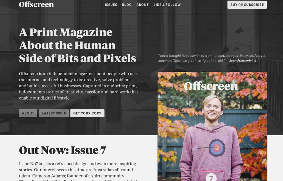
by Giovanni DiFeterici | Mar 4, 2014 | Gallery
Offscreenmag.com looks great at all screen sizes. I really enjoy the balance of the typography and soft grays. The site does a great job of balancing a lot of information with a minimal design language. Simple and elegant. We get the mag and that’s nifty too....

by Giovanni DiFeterici | Mar 3, 2014 | Gallery, Medical
Vest provides a really nice loading experience, considering it is a site that transfers 1.4MB when loaded. The main view loads a simple graphic and then loads in the heavier images whenever they are a available. The effect is something like a load screen that...

by Gene Crawford | Mar 3, 2014 | Gallery
Really simple minimal approach done well. I like the logo, then to see it used again on top of the guy’s self-portrait illustration. Nice simple layout that let’s me see the work really fast while looking engaging at the same time.
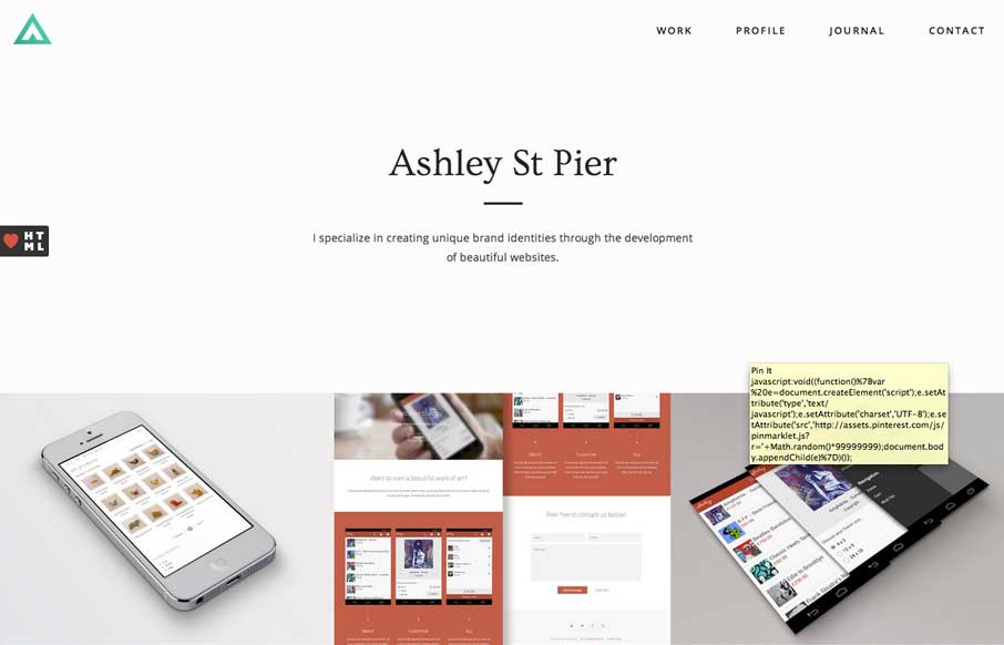
by Giovanni DiFeterici | Mar 3, 2014 | Gallery, Portfolio
Ashleystpier.com is big and beautiful. This kid is drinking the minimal Kool-Aid and it is working. Very nice portfolio site with minimal detailing and superb balance.
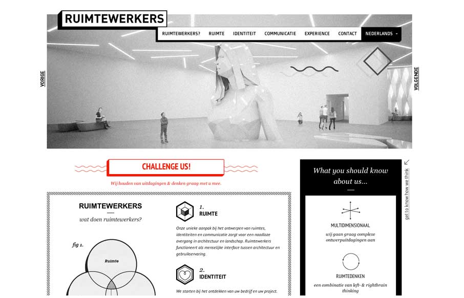
by Gene Crawford | Feb 28, 2014 | Design Firm, Gallery
I like the stark black and white box design of this website. Very simple and clean yet it almost feels gritty due to the way the boxes are used. That fixed nav section is pretty slick. I like how it just folds down to “nav” for mobile screen widths...
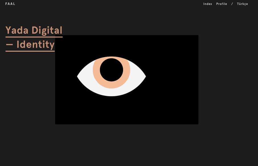
by Gene Crawford | Feb 28, 2014 | Gallery, Portfolio
Very nice portfolio site. I really dig the dark design and the simple way the title of the work is presented overly large like that. Very cool.