
by Gene Crawford | Oct 2, 2014 | Gallery
Super rich visual design. I love the slight movement on each section as you get to it based on how you’re scrolling. The nice big services list and descriptions is nice. You don’t typically see that and I like it here, it’ll help educate new people...

by Gene Crawford | Oct 1, 2014 | Food and Beverage, Gallery
What a beautiful and soft feeling site design for Society Cafe. I love the soft colors and thin line work used across the page. The video in the background is a good touch to keep a kinetic vibe going as you scroll down the page too.
by Gene Crawford | Oct 1, 2014 | Gallery
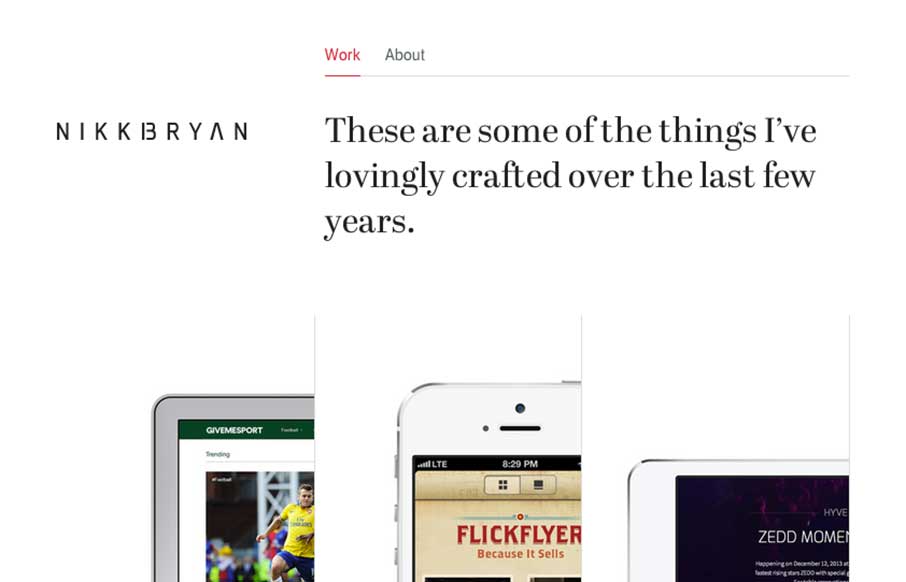
Really slick display of work here. I love how the design is unique in it’s work display, showing it on devices and in an interesting visual way. Also very nice responsive tweaks. Submitted by: Nikki Bryan @nikkibryan Role: Designer &...
by Gene Crawford | Oct 1, 2014 | Gallery
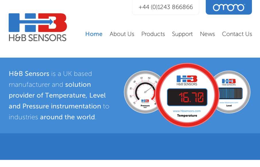
Really beautifully done animations, strong layout with a decent narrative about the company. It also has really nice responsive tweaks too, things feel natural and fit well on most screen width sizes here. Bravo. H&B Sensors is an intuitive, visually striking and...
by Gene Crawford | Sep 30, 2014 | Gallery
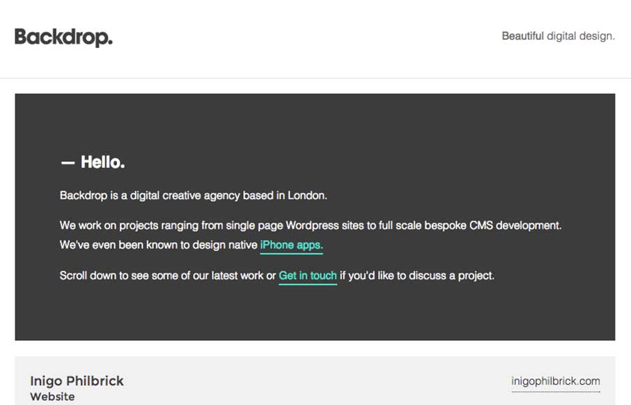
Neat layout and approach. Show some work, show what’s next, boom. I like it.

by Gene Crawford | Sep 30, 2014 | Gallery
I love this site design. I like the simple and clean nature of it. I like the hero graphics and the way the other sections are displayed. I can’t understand why the initial load of the page would hide the main nav under the hamburger icon though. Is it mainly to...
