by Gene Crawford | Jul 19, 2023 | Design Firm, Gallery
Coupling state-of-the-art technology with stunning designs, ainsley.dev creates bespoke websites & custom in-house software from startups to established brands.

by Gene Crawford | Jul 18, 2023 | Gallery
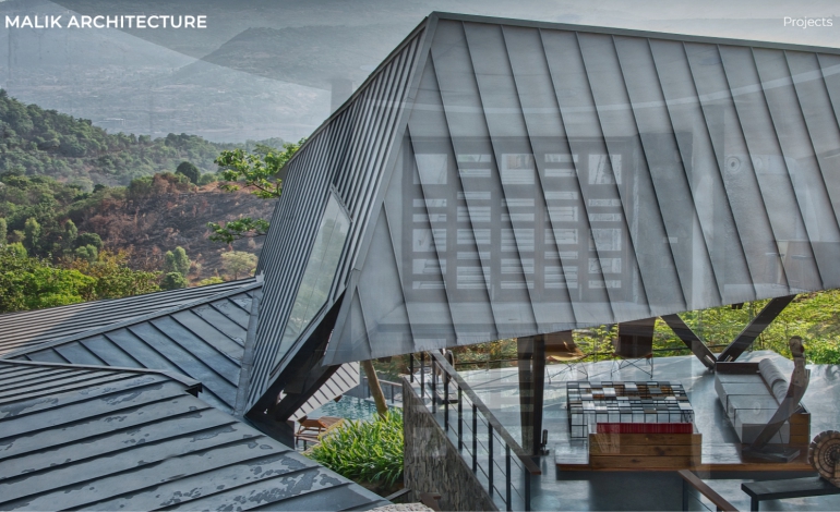
Malik Architecture is an esteemed architectural firm dedicated to creating innovative, sustainable, and visually striking designs. With a passion for pushing the boundaries of architectural creativity, Malik Architecture is committed to delivering exceptional...

by Gene Crawford | Jul 18, 2023 | Design Firm, Gallery
Modern design and easy to navigate!

by Gene Crawford | Jul 17, 2023 | Design Firm, Gallery
We are a creative web design agency in London, that specializes in bespoke and affordable website design, web development, SEO service, and eCommerce solution.

by Gene Crawford | Jun 28, 2022 | Entertainment, Gallery
https://warriormindset.us/...

by Gene Crawford | May 11, 2020 | Design Firm, Gallery
terminal-like navigation personal website inspired by Commodore64 monitor colors and design. Name: Paolo Meola Short Author Bio: I am a digital entrepreneur with a solid technical background. Role: Designer & Developer Twitter: @ymx1zq Country:...
