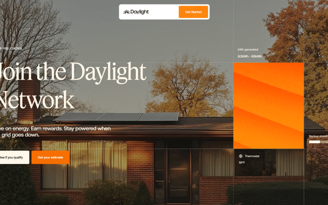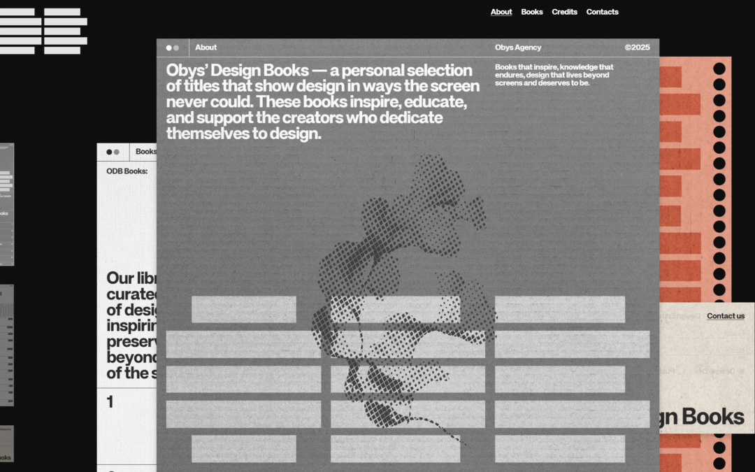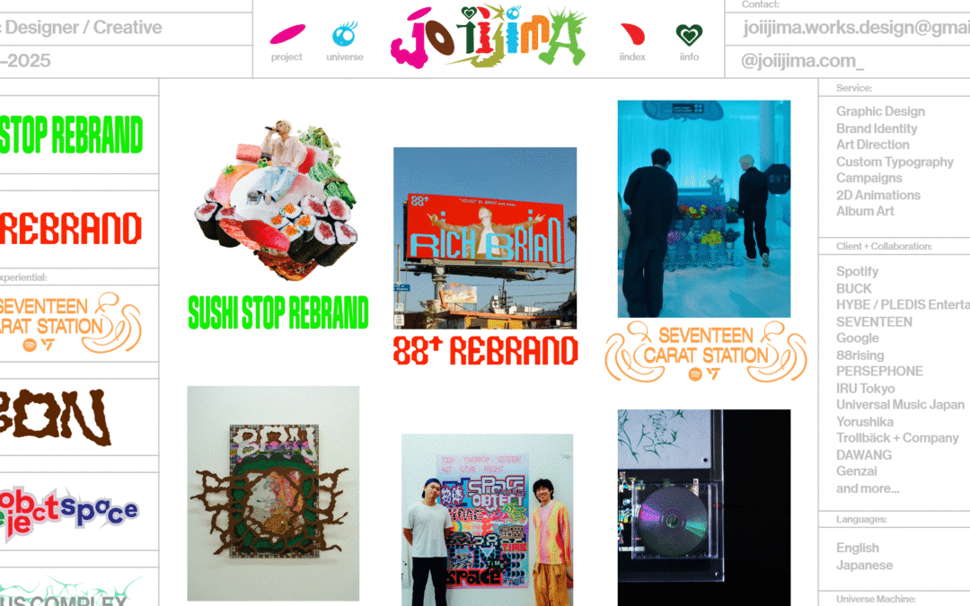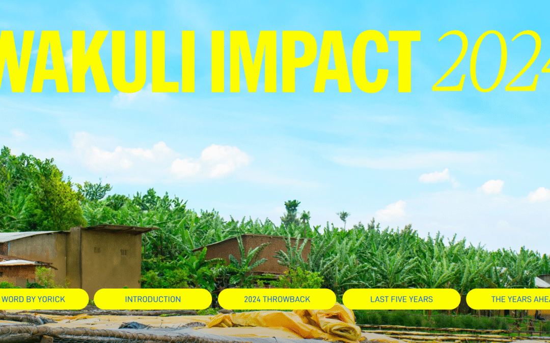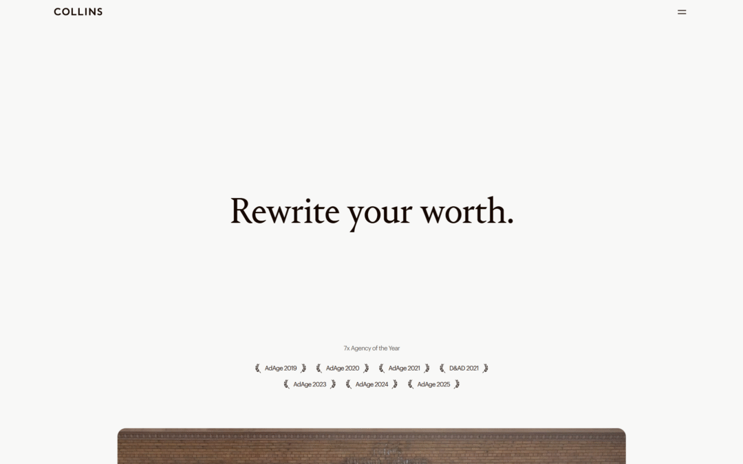
Man, that page load "screen" is a solid piece of interaction. The video for it is chosen perfectly and it's just a small detail that I love. I also love the grid and the way the type has such solid interplay with the layout. The colors feel classic yet somehow it's...
Push 10
Very solid agency styled website design. I LOVE the use of large imagery and video like they've done here, much like Apple does with their stuff. The scroll interaction timing is well done and man, you just can't go wrong with strong/clean typography! Great work!
Magnet Co Web Agency – Websites that resonate
Magnet Co is a full-service digital agency with a human-centric approach to design and development.
Katie Chin
This is a custom portfolio designed and built to make the viewing experience of work effortless and immersive. Each project scrolls right into the next for busy hiring managers who have limited bandwidth. The full-width photos and themed sections helps us focus on the...
Spring/Summer
I just LOVE the tight layout and grid that's paired with such distinct differences in typographical choices. So solid. Different colors for each page/section just reinforces the thoroughness feeling behind the brand. Great work.
4-Stages
An art collective of worldwide talent, incorporating modern stylistic designs. Based in Malaysia and Singapore.
Altaura
A full service sound agency that provides music curation services and background music for businesses and brands. Based in London, UK and Santa Monica, US they create playlists and songs that increase revenue.
Recurziv
Interesting design study for this website. The main layout IS the navigation. I can't say how well this would work in a purely UX review but from a gallery/design perspective it's worth the time and study.
Survey analytics
“Survey analytics” helps businesses take maximum advantage from modern technology. Automating data analysis with artificial intelligence means leaving the rivals far behind. AI’s potential is not discovered completely so that is just a beginning of the story.
Spaces Urbanistic
I don't really care that this is webflow - it's nice. You can study it as a template if you like. I love the scrolling interaction/animation. So clean and timed perfectly.
Shine Shop
I present this design into the gallery because it occurs to me just how close to "Flash" websites we've gotten now. I mean this site is decent, it works, it's Responsive. It just reminds me like 100% of a "Flash" site. Not sure how i'm feeling about this...
LUIS VAZ designer
Designer, Freelancer, Branding, Logo Design, Naming, Portugal, Lisboa
Torus Kit – Interactions made effortless
Create interactive effects, animations, and transitions without writing any JS or CSS, and keep focused on your HTML.
Thakeham
Thakeham is one of the South East’s leading developers. A team of industry experts, we deliver to consistently high standards in residential development, contract build and land promotion opportunities.
State of CSS 2023
Cool project and also the website itself is pretty nifty. A cool little loading logo illustration and line work. It's not going to win any design awards but I think it's worth checking out not only for the content but check out it's tricks.
Website Design Auckland NZ
A clean, sophisticated black and white website design with a sharp font and subtle animations that bring the website design to life. We've used minimal, custom-designed icons for the menu navigation and large, hero images to showcase the portfolio. Large hero images...
Aime Chen
I LOVE minimalism... It's the most singularly difficult thing to pull off in a website design. It's not just about being 'simple' or 'clean' you have to do simplicity while still communicating properly.
lullabot
Been a fan of Lullabot for a long time. Recently checked out their website and it made me so happy. Very nice clean and crisp solid layout with snappy load times and responsive views. Love it.
christinaallan.com
Another great example of a minimalist design. It takes the right project to be able to employ minimalism in such a great way - often it's a portfolio or resume website.
SVZ
SVZ Design showcases its mastery by aligning the agency's processes and brand identity with elegantly animated motifs, seamless transitions, and captivating visuals. This meticulous approach not only delights the user's eye but also serves as a testament to the...
Fensea
A concept of the Fensea brand is inspired by the extensive benefits of sea salt. Sea salt has firmly entered into modern cosmetology, as it helps to solve many problems associated with the face and the whole body.
Wayside
The website design features a prominent green background that establishes its visual ambiance. The incorporation of mixed font pairings, scroll-based navigation, and high-quality photography enhances the overall user experience, encouraging exploration. Interactive...
Bryan Scott
Love this personal/portfolio website. The movement around the interactions just feels great. The minimal approach also really allows the interaction to be noticed and enjoyed. This made me smile to click around. 🙂
fikir’den barış dayak
I like the feel of this design. It feels kinda like a toy or plastic somehow. Nice illustrations and layout too.
Crush Pixels
We Have Lift Off! Our New Website Has Launched. After a number of months of planning, designing and creating, we’re excited to announce that our new and refreshed website is live A significant change has just taken place for Crush Pixels. Our company’s website has...
Coalesce | Digital Product Agency in NYC
This is the Coalesce homepage—a destination for potential clients to find our services, see our portfolio, understand our brand, discover our side hustles, and meet our space pigeon mascot, Eleanor.Design Lead: Alex Severino
Bunsen
What a fun website to move through. I really enjoy the little details that are happening behind my cursor moving around – they didn't take over my cursor, they've just provided some visual interaction to make me take note of the page more. The scrolling interactions...
Parashift Technologies
Parashift Technologies is a leading integrated digital marketing agency that provides innovative solutions to businesses of all sizes.
MVP Assembly Line
Mix of fun and boldness. It’s all about the design concept for our new service – MVP Assembly Line.
co&co
Neat total page "swipe" as you scroll and stuff. Pretty simple layout but bold interaction. Neato. co&co is a straight-talking, results driven marketing consultancy in Manchester, UK. Built in Craft CMS, the website for co&co is a further extension of their...