
by Gene Crawford | Oct 3, 2012 | Design Firm, Gallery, Screencast Review
There’s so much design goodness here it’s making me giddy. From the rich colors, the way the home page slider has been designed to the custom photography it’s just a super high level effort. Check out the more in depth video review above or at this...
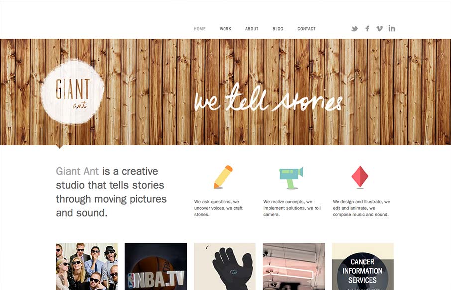
by Gene Crawford | Sep 20, 2012 | Design Firm, Gallery
Nice simple and effective website design, it does what it needs to do and packs it in with a clear yet dense layout. I like the way these guys are selling themselves as a “storytelling” agency, that’s a fun and compelling message to me. Love the wood...

by Gene Crawford | Sep 17, 2012 | Design Firm, Gallery
Pretty crazy design with the full screen background video. Love the cow suit! The interactions are all over the place but look interesting and there is real content here too. Overall pretty fun website design and I dig it.
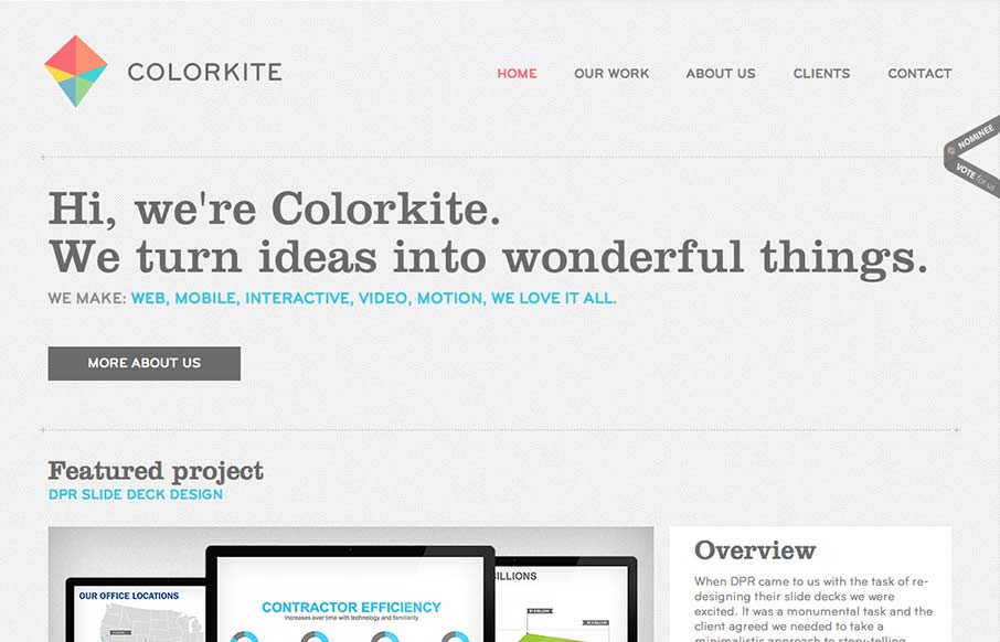
by Giovanni DiFeterici | Sep 11, 2012 | Design Firm, Gallery
Colorkite is a clean, minimal design that does a great job at getting out of the way of the content. The typography is pretty solid and the color palette is subtle and sophisticated. The site is responsive, though it looks a little disjoint at some screen sizes. The...
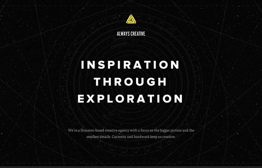
by Giovanni DiFeterici | Sep 10, 2012 | Design Firm, Gallery, Screencast Review
This site is beautifully wide open, with subtle animations and a complex mix of textures. It is somewhat narrative through a combination copy about exploration and imagery of space. Their vision is simply stated, which I like, and the design is super-clean (which I...
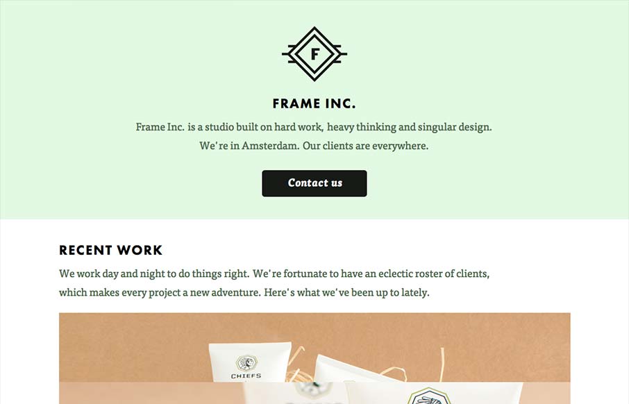
by Giovanni DiFeterici | Sep 5, 2012 | Design Firm, Gallery
I can really get behind the minimal approach to content that frameinc presents. The site isn’t cluttered up with overblown copy or quirky language and I’m not forced to wade through a huge portfolio to get a sense of what this business does. The design and...