
by Gene Crawford | Nov 22, 2023 | Design Firm, Gallery
VRC is a record and information management company that specializes in protecting other companies’ vital records. VRC ensures that every piece of information a company produces is organized, accounted for, and protected.
by Gene Crawford | Nov 22, 2023 | Design Firm, Gallery
Straightforward design here. I like the details of the main image breaking the horizontal line, then the big D-Sign type scroll effect.

by Gene Crawford | Nov 21, 2023 | News
A trend that has becoming sort of ubiquitous in recent years is the “fixed navigation” design element. This design element involves keeping the main navigation elements of a website stationary, whether in the header or on one of the sides of the layout....

by Gene Crawford | Nov 21, 2023 | Gallery, Software
I think corporate-vibe websites get ignored in galleries mostly. I really like this one, the simple and straightforward layout and then the details here and there make it really work. I especially like the “skills” section towards the bottom of the home...
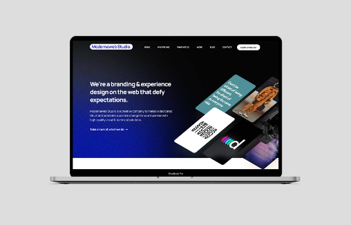
by Gene Crawford | Nov 20, 2023 | Design Firm, Gallery
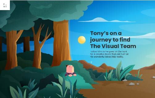
It is about Tony, the mascot they’ve created on his way to look for graphic design agency to turn his idea to reality. Funny. I like how this is a non-traditional look at a home page. It’s fun, it’s hard to say that about A LOT of agency websites....