
by Gene Crawford | Jun 28, 2012 | Gallery
This is the wedding invitation/announcement website for Jessica Hische and Russ Maschmeyer. There is a lot of beautiful illustrations and just purely joyful feeling effort put into this website. There are some neat little easter eggs you can find in the site too, I...
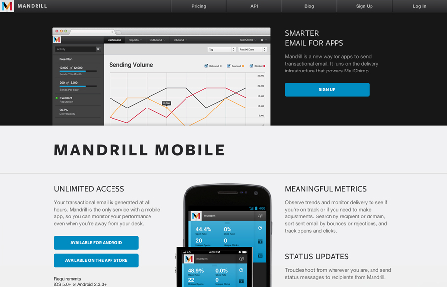
by Gene Crawford | Jun 27, 2012 | Gallery
The Mandrill site is a such a nice product/app website. The experience is clean with a few little visual treats here and there, like the slight parallax type image shift on the two mobile phone images. Good responsive design too. I particularly like the signup form...
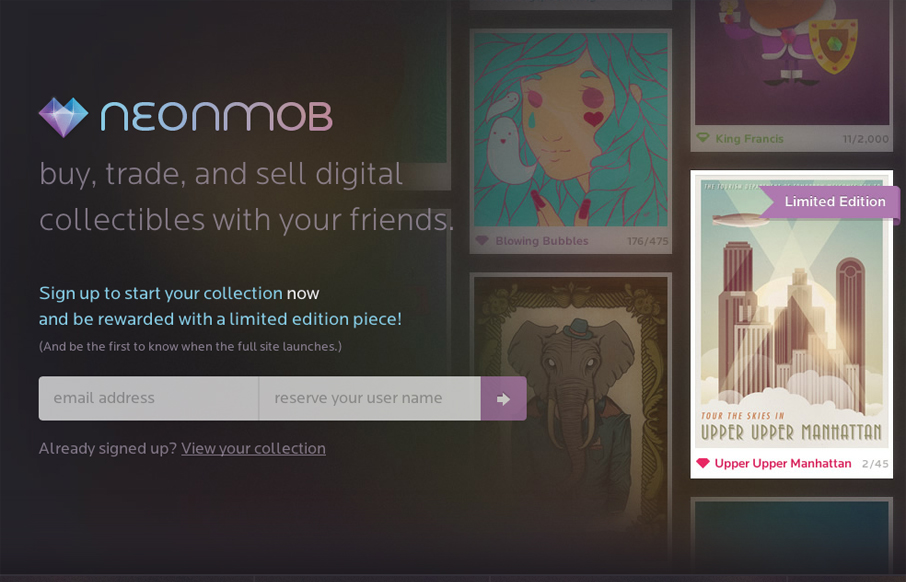
by Gene Crawford | Jun 27, 2012 | Gallery
I love the interactions on NeonMob. They’re simple color shifts and sliding shapes but the overall experience is delightful. That’s really all it takes sometimes to really draw you into singing up. In this case, onboarding by great interactions, it’s...
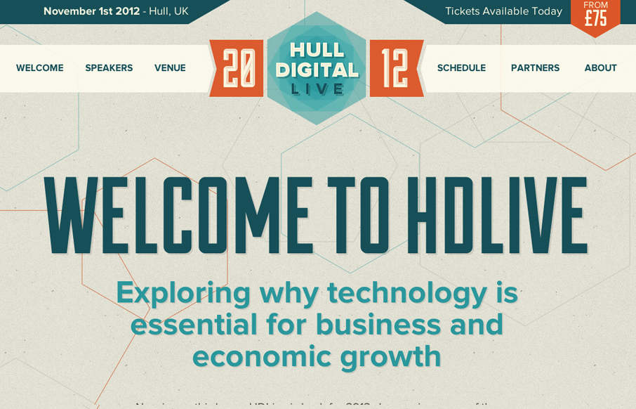
by Gene Crawford | Jun 27, 2012 | Gallery
The Hull Digital Live conference website is a nice responsive top navigation design to study. I like the pattern here of going with the fixed top nav then as you get smaller screen widths, it still stays fixed but folds out with a slight transparency on it. It’s...

by Gene Crawford | Jun 25, 2012 | Gallery
We’ve worked really hard on this new version of our site to use HTML5, CSS3 and javascript to create an interesting, exciting and user-friendly experience (with a bit of humour) for our potential new clients. Submitted by: Daniel Ogden @Soul_Media Role: Designer...