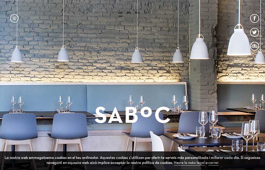
by Gene Crawford | Oct 10, 2014 | Food and Beverage, Gallery
Cool site design. I like the vibe of this single pager. The hamburger icon is in play here, but it’s really just for anchors along the page. Nice use of that in this instance IMHO.
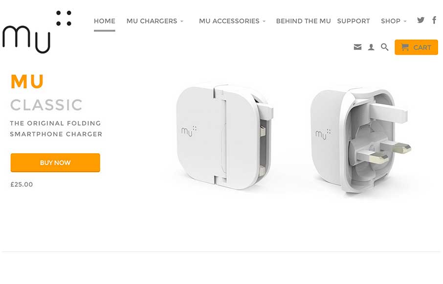
by Gene Crawford | Oct 9, 2014 | Gallery
Very nice clean layout for mu the folding smartphone charger. Like the product design the website design echos the design ethos. I love that.
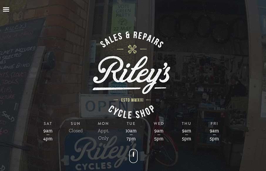
by Gene Crawford | Oct 9, 2014 | Gallery, Sports/Recreation
Beautiful site design. I love the video image in the background of the main hero area. The little scroll graphic using the mouse and the length of the scroll wheel is smart too.
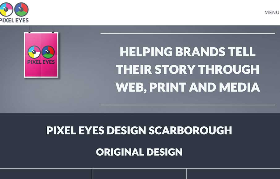
by Gene Crawford | Oct 9, 2014 | Design Firm, Gallery, Marketing Company
Nice little details here, like the way the main nav scales down in size as you scroll down and then comes back as you scroll back up. Nice grid layout with some bold graphics and overlay interactions. This is our digital design agency website. I wanted to utilise all...
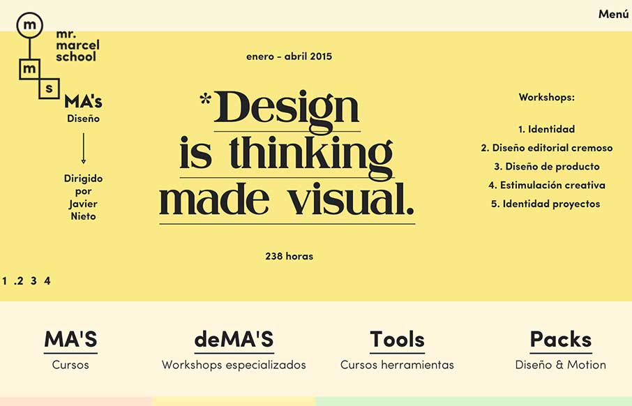
by Gene Crawford | Oct 8, 2014 | Education, Gallery
What a fun looking visual brand. Nice to see it spill out onto the overall layout and design of the website too. Lovely stuff.