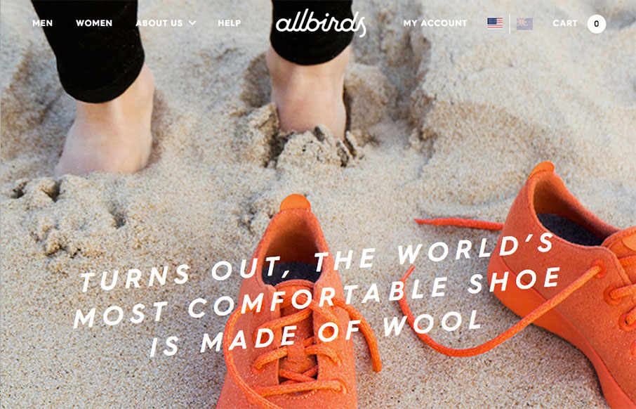
by Gene Crawford | Mar 22, 2016 | Fashion, Gallery, Shopping
Very nice product website for the Allbirds shoes. I freaking love this site design. It’s almost immersive. The photography and editorial for the different sections is all very well done and the timing on placement and video, etc… makes me smile. Now to get...

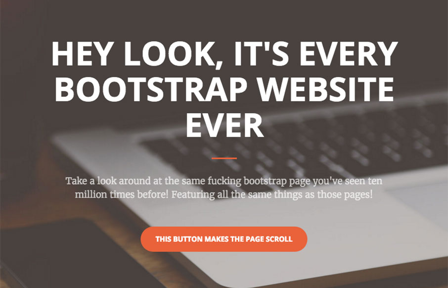
by Gene Crawford | Mar 22, 2016 | Gallery, Portfolio
Dayum man. I love the bold approach to the typography here, it’s a breath of fresh air really. Simple and to the point too. Some nice detail work here and there, solid and awesome work.

by Gene Crawford | Mar 21, 2016 | Gallery
It took me a bit to figure out just what this website was for, but once I got it, it’s all good. Beautiful design pieces and the website itself has a lot of visual power to me. Romance!
by Gene Crawford | Mar 21, 2016 | Gallery
Agreed…

by Gene Crawford | Mar 21, 2016 | Gallery, Government
New(ish) website for the US Airforce here. There is some serious inspiration to gain from this site. It’s executed quite well and has a ton of detail work. Like the main navigation design, I love how it becomes another part of the website almost, not just a big...