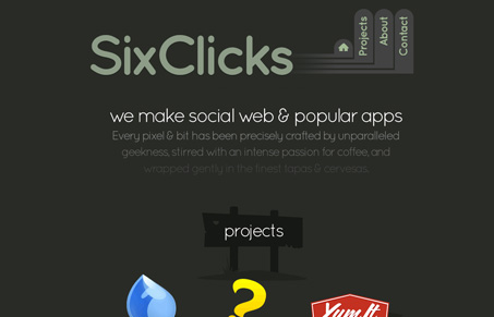
Nice single page site, I like the way this design feels when you click around on the nav for some reason. Normally I wouldn’t like the nav text to be turned vertically like it is here but it’s simple enough that it’s legible just as if it was horizontal. There’s not a lot here content wise it’s more of a launchpad site but with screenshots in modal windows instead of leading you to live pages of the apps themselves. But it’s a nice little site for what it does and I think it probably works well for this company.
Glassmorphism: The Transparent Design Trend That Refuses to Fade
Glassmorphism brings transparency, depth, and light back into modern UI. Learn how this “frosted glass” design trend enhances hierarchy, focus, and atmosphere, plus how to implement it in CSS responsibly.


0 Comments