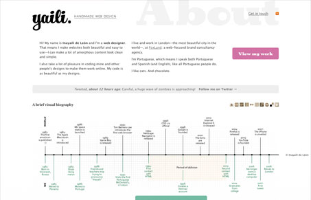
I love the simple design style here, the whitespace and rhythm of the design is very nice. The thing that intrigues me the most is the way the bottom half of the site is treated with the draggable design elements. Then the odd time-line that takes up most of the visual real estate of the site. Don’t get me wrong I really love it, it’s clever and looks great. That’s really smart thinking that gives us a really unique result to look at.
Glassmorphism: The Transparent Design Trend That Refuses to Fade
Glassmorphism brings transparency, depth, and light back into modern UI. Learn how this “frosted glass” design trend enhances hierarchy, focus, and atmosphere, plus how to implement it in CSS responsibly.


0 Comments