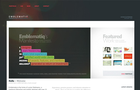
I really love the portfolio layout of this website. Nice big(ish) thumbnails that lead to a full screen shot and some background info on the project, all done with a bit of nice clean design style. I do feel like there’s too much white space between the content section and the right sidebar section, it really show’s itself on the home page, where the smaller details seem out of place when put up against the whitespace void. Overall this design is quite good, I really spent some time looking around on the site and all it’s content, so in the end it really engaged me.
Glassmorphism: The Transparent Design Trend That Refuses to Fade
Glassmorphism brings transparency, depth, and light back into modern UI. Learn how this “frosted glass” design trend enhances hierarchy, focus, and atmosphere, plus how to implement it in CSS responsibly.


0 Comments