ronniemoralesdesign.com

ronniemoralesdesigncom

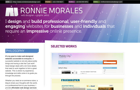
This has a colorful, borderline Apple look to it with the purple and blue rays. The slight angle on the white border adds some visual interest. I like that he kept it simple with the portfolio. It’s always better to display a few of your best websites than a whole lot of mediocre. I understand that he is a freelancer so his contact information is readily available at the top but because he has used a non web-safe font it isn’t selectable which might be something to think about.

Also, can someone explain to me why people put their website url on their website (topleft) ? I really am wondering..


ronniemoralesdesigncom

This has a colorful, borderline Apple look to it with the purple and blue rays. The slight angle on the white border adds some visual interest. I like that he kept it simple with the portfolio. It’s always better to display a few of your best websites than a whole lot of mediocre. I understand that he is a freelancer so his contact information is readily available at the top but because he has used a non web-safe font it isn’t selectable which might be something to think about.

Also, can someone explain to me why people put their website url on their website (topleft) ? I really am wondering..

Kinsta

0 Comments

Submit a Comment

Your email address will not be published. Required fields are marked *

Time limit exceeded. Please complete the captcha once again.

News & Articles

The Call to Action, Revisited

The Call to Action, Revisited

The Call to Action hasn’t changed in a decade, but the bar has. A fresh look at prominence, copy, mobile tap targets, and accessibility, with lessons from three major design systems.

Brutalism: The Beauty of Breaking the Rules

Brutalism: The Beauty of Breaking the Rules

Brutalism in web design rejects perfection for authenticity. Stark grids, raw type, and honest structure create interfaces that feel human, intentional, and impossible to ignore. Break the rules, on purpose.
