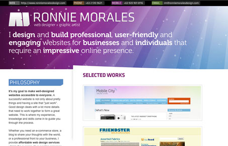
This has a colorful, borderline Apple look to it with the purple and blue rays. The slight angle on the white border adds some visual interest. I like that he kept it simple with the portfolio. It’s always better to display a few of your best websites than a whole lot of mediocre. I understand that he is a freelancer so his contact information is readily available at the top but because he has used a non web-safe font it isn’t selectable which might be something to think about.
Also, can someone explain to me why people put their website url on their website (topleft) ? I really am wondering..


0 Comments