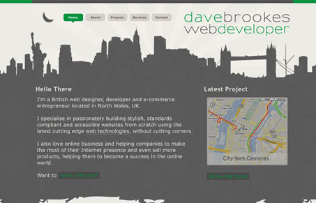
I like the play between the dark background and white background that holds the main copy and extras on this site. The top of the site is a skyline, which is done quite well, and the bottom just becomes shapes that somehow work together visually. There’s not a ton of info on this site but somehow it has a sense of expansiveness, perhaps that’s the skyline graphic working on me.
Glassmorphism: The Transparent Design Trend That Refuses to Fade
Glassmorphism brings transparency, depth, and light back into modern UI. Learn how this “frosted glass” design trend enhances hierarchy, focus, and atmosphere, plus how to implement it in CSS responsibly.


I like the skyline as well, and the fact that I am able to recognize landmarks from all over. Upon looking a little closer you are even able to see retro type rays shining out from behind the skyline background. A few of the minor details like this really make the site.
Nice observation Shay, I didn’t actually catch that earlier. Very true on the details making the site.