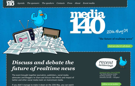
You gotta love a twitter bird on steroids… I really like the blue background of this website, the texture/pattern gives it what it would otherwise be lacking. I also like the transition from the blue to the white background with the pattern. The illustrations are clever and gives it a nice sense of hand-crafted-ness (I know that’s not a word.) The footer starts to lose me, in that I don’t think it’s executed as well as the rest of the page. Overall though, this is a pretty good conference website.
Glassmorphism: The Transparent Design Trend That Refuses to Fade
Glassmorphism brings transparency, depth, and light back into modern UI. Learn how this “frosted glass” design trend enhances hierarchy, focus, and atmosphere, plus how to implement it in CSS responsibly.


I really really like this site – but it must be wider than 960px. It gives me a horizontal scroll bar on my old secondary laptop.
@Ryan – not sure man, doesn’t seem to do that for me. Could be a specific browser thing? Would be cool to know what browser you’re running.