
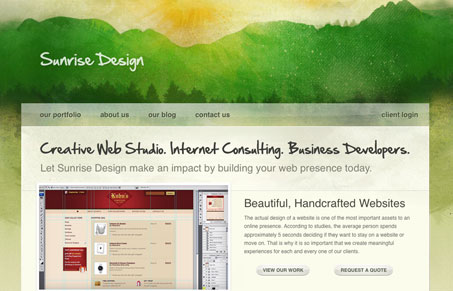
I really like the texture used in this design, the watercolor feel is really well done. The site leads down to a leather-like texture in the footer and the two column layout above that is rather effective. I think the header is way to big to and makes the different state tabs for the main section push below the fold, that’s likely going to be hidden to most visitors.


Chunking: How to Design for a Brain That Can Only Hold Four Things
Your working memory holds about four things, not seven. Chunking groups loose information into meaningful units that slip past that limit, the psychology behind phone numbers, scannable pages, multi-step forms, and grouped navigation.


The watercolor header just seems to rip-off Viget Design blog (http://www.viget.com/inspire/) a bit too much and the state tabs for the main section are a bit too similar to expression engine’s site (http://expressionengine.com/)…
The tab interface is very similar to that on the Expression Engine site (http://www.expressionengine.com)