
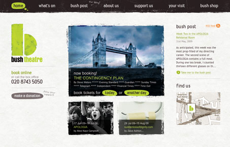
I really like the texture of this design, it’s not too over powering and used to mainly break up the lines around blocks of colors and sections. The header navigation looks really neat and works in very well with the feel of the rest of the site.


Fitts’s Law: Why the Easy Button Wins
Large, close targets are faster to hit than small, distant ones, that’s Fitts’s Law. A look at the 1954 rule behind buttons, prime and magic pixels, thumb zones, and dark patterns.


Love this design – perfect demonstration of how simple stylistic choices and palette consistency work to produce pure elegance.