
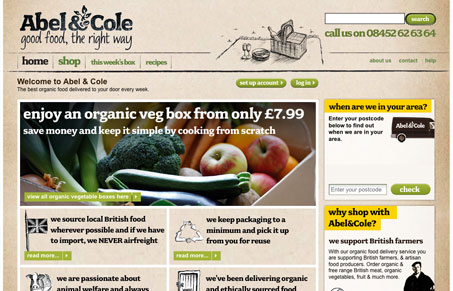
I really like the overall feel of this design. The paper-like background and the hand-drawn lines, really nice. The thing that’s sticking with me is how all the copy is bold, I don’t know what’s what from a regular to bold set hierarchy in regards to the content and as a result the site/content is difficult to scan. I really like how all the action items (links & buttons) are all the same consistent green color, that makes it easy to spot the calls-to-action on the page.


Fitts’s Law: Why the Easy Button Wins
Large, close targets are faster to hit than small, distant ones, that’s Fitts’s Law. A look at the 1954 rule behind buttons, prime and magic pixels, thumb zones, and dark patterns.


0 Comments