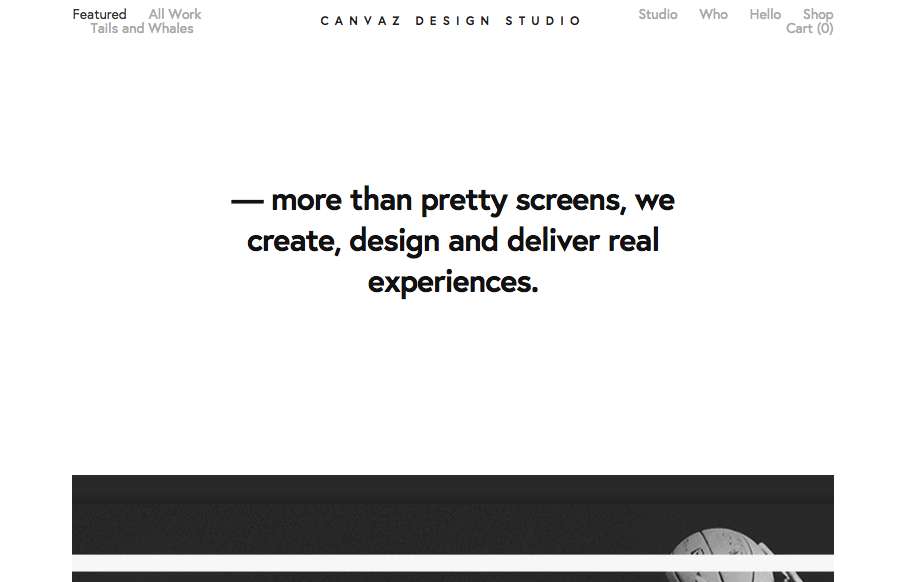
Canvaz Design Studio

http://www.canvaz.io/

Pretty cool breakdown of the links/interface on top of what is essentially a poster. I dig the graphic design approach a great deal here.

From the Designer:

This was made with the sole purpose of showcasing what we do best but also to some hidden and cool details that are an extent of our soul.
The hardest thing was adapting an existing framework in a creative way and that is one of our strengths, do the best with what you have!
We are proud of our work so we made it clear to everyone. Thank you.

Submitted by: Luis Vaz
Twitter: @canvazdesignst
Role: Designer
Country: Portugal

1 Comment

Submit a Comment

Your email address will not be published. Required fields are marked *

News & Articles

Sign-Up: Enhancing Conversions through good UX

Sign-Up: Enhancing Conversions through good UX

Optimize your website’s sign-up process by focusing on clarity, ease, and user mindset. Clearly explain the purpose, benefits, and steps, and use social proof to build trust and drive conversions.

The Essential Guide to Getting Started on Freelance Writing

The Essential Guide to Getting Started on Freelance Writing

Explore the lucrative and fulfilling world of freelance writing with our essential guide. Learn about specialties like blogging, social media, article, and technical writing. Build a portfolio, find work, set up your business, and discover the potential earnings. Embrace the freedom of working from home and follow tips for success in your dream career.